One of the reasons new entrepreneurs are hesitant to start an online store is because they fear the customer support.
Steve, am I going to have to install a support line for my shop? I’d rather not have to deal with customers directly over the phone. Can I just put up an email address and call it a day?
While having to deal with the inconvenience of phone support is definitely a valid concern, I don’t fear customer support at all. In fact, I embrace it. And if I could get every single customer on the phone I would.
Why? It’s because good things always happen when I talk to a customer directly. Not only are the chances of converting a sale drastically increased, but customer calls have resulted in many major bug fixes for my website.
Today, I want to share with you a killer bug with my mobile site that has been driving customers away for almost a year!
Hint: It involves mobile checkout and iPhone autocorrect!
Get My Free Mini Course On How To Start A Successful Ecommerce Store
If you are interested in starting an ecommerce business, I put together a comprehensive package of resources that will help you launch your own online store from complete scratch. Be sure to grab it before you leave!
Darn You AutoCorrect!
One day, I just happened to be stalking a customer online when I noticed some very strange behavior. This person had a ton of merchandise in their shopping cart but kept going back and forth between 2 pages on the website.
One moment they’d be on the checkout page and then they’d go back to the shopping cart page and then back to the checkout page…over and over again. In fact, this inexplicable web surfing pattern continued for about 10 minutes.
Now under normal circumstances, I would have called this person right away but I didn’t have their info yet because they hadn’t completed the first page of checkout. So all I could do was wait.
And even though I couldn’t see the customer’s face, I could tell that they were getting frustrated and that we were likely to lose the sale.
Fortunately, the customer finally decided to call us on the phone to place her order online.
Wife: We are so sorry. How can I help you?
Customer: My son told me that shopping on my iPhone is supposed to be easy and straightforward, but for the life of me I can’t seem to checkout on your site
Wife: I’d be happy to take your order over the phone.
Customer: Thank you so much. I’ve had it up to here already. This stupid phone would not let me enter in my city and email address correctly!!! And I was getting so frustrated that I wanted to throw my phone across the room.
Wife: We’re so sorry about that. Would you mind describing your exact issue to me for our knowledge?
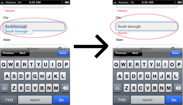
It turns out that this nice lady lived in a town called “Southborough”. But her IPhone would not let her enter in her city correctly because it kept turning “Southborough” into “South borough”.
Her IPhone thought it was doing her a favor by correcting her typing but it wouldn’t let her enter in her city correctly.
Addressing The Autocorrect Issue
Sure enough, when I tried entering in “Southborough” on my wife’s IPhone, it kept trying to auto correct the city as well. And like this lady, I was getting a little frustrated that it took so much effort to get the phone to register my typing correctly.
After doing a little web research, it turns out that I had a critical design flaw in my mobile site. To prevent a web browser from interfering with a customer’s input, you are supposed to turn off auto correct on all forms for smartphones and tablets.
Fortunately, turning off autocorrect was easy to do…
For all of your forms, you simply need to add the following tag to all of your text input fields.
And for good measure, you should also turn off auto-capitalization and auto-complete by adding auto-capitalization=”off” and auto-complete=”off” to all of your forms as well.
Once I made these changes, it was very straightforward to enter in the correct address. We were lucky that this customer decided to call, because I probably would not have thought of this potential problem.
And even though I tested our mobile website very thoroughly, I did not think to test names and forms that the IPhone would try to auto correct.
Making Phone Numbers Clickable
After this customer fiasco, I decided to do a more thorough analysis of my mobile web forms by specifically paying attention to usability and here’s what I came up with.
First off, and this is just a hunch, but I believe we would have lost this customer for sure had we not had our telephone number prominently displayed in the footer of our mobile website.
But I was really lucky and here’s why. Android and iOS do a great job of automatically making phone numbers clickable by default.
But since I didn’t actually write any code to explicitly make the number clickable, our click-to-call number might not work across all phones.
In general, it’s better to err on the side of caution and not rely on auto-detection, so here’s the code to make phone numbers clickable on a phone.
First off, you want to turn off any auto-detection that the phone offers already because you want to prevent the OS from making random numbers accidentally clickable.
Then, you want to turn your phone number into a link
Making Form Entry Even Easier
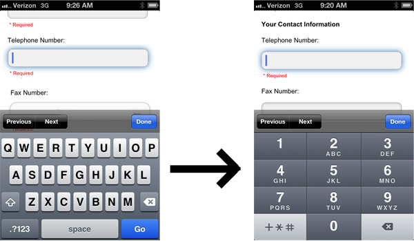
One other thing that I noticed while trying to place an order was that entering my phone number was a bit clunky. Since my standard phone keyboard puts all of the numbers in the top row of my phone, it’s very easy to make a typing mistake.
Fortunately, there are a few HTML5 constructs that make typing in numbers easier.
By adding the following tags to the telephone input field, you can make certain phones (most importantly the IPhone) use a telephone keyboard instead of the standard keyboard when entering in numbers.
Adding these tags to your phone number input fields will pop up the numeric keyboard to make number entry much easier.
Conclusion
When it comes to mobile phone and tablet usability, I’ve clearly got a lot to learn:) But now that I’m more aware of the potential issues, I’m better able to spot bugs and problems with our design.
But if there’s a lesson to be learned, it always pays to talk to customers and ask them for their opinions on usability. After all, they are the ones paying the bills and it’s in your best interests that they have the smoothest shopping experience possible.
Good luck with your shop!

Ready To Get Serious About Starting An Online Business?
If you are really considering starting your own online business, then you have to check out my free mini course on How To Create A Niche Online Store In 5 Easy Steps.
In this 6 day mini course, I reveal the steps that my wife and I took to earn 100 thousand dollars in the span of just a year. Best of all, it's free and you'll receive weekly ecommerce tips and strategies!
Related Posts In Conversion Optimization
- Poorly Designed Websites: 9 Mistakes Ecommerce Store Owners Make (And How To Fix Them)
- How Adding A Payment Plan Can Affect Your Sales – The Good, The Bad And The Ugly
- How To 2X Amazon Sales By Using Viral Launch, Scope And Long Tail Pro To Target New Markets
- The Dangers Of Using Free WordPress Plugins And Javascript Code On Your Site
- How To Increase Your Amazon Sales Rank By 209% With A Simple Photo Tweak

Steve Chou is a highly recognized influencer in the ecommerce space and has taught thousands of students how to effectively sell physical products online over at ProfitableOnlineStore.com.
His blog, MyWifeQuitHerJob.com, has been featured in Forbes, Inc, The New York Times, Entrepreneur and MSNBC.
He's also a contributing author for BigCommerce, Klaviyo, ManyChat, Printful, Privy, CXL, Ecommerce Fuel, GlockApps, Privy, Social Media Examiner, Web Designer Depot, Sumo and other leading business publications.
In addition, he runs a popular ecommerce podcast, My Wife Quit Her Job, which is a top 25 marketing show on all of Apple Podcasts.
To stay up to date with all of the latest ecommerce trends, Steve runs a 7 figure ecommerce store, BumblebeeLinens.com, with his wife and puts on an annual ecommerce conference called The Sellers Summit.
Steve carries both a bachelors and a masters degree in electrical engineering from Stanford University. Despite majoring in electrical engineering, he spent a good portion of his graduate education studying entrepreneurship and the mechanics of running small businesses.


Steve,
It is very nice that you give real life examples of some of the everyday life challenges that you are facing as an online entrepreneur. Not everything about selling online is as simple as putting up a website and watching the money roll in. If it was everyone would be doing it.
Thanks Jim. There’s a lot of change going on in the ecommerce industry and it’s been a fun challenge to keep up
Great article Steve. The auto correct can be annoying. Making the phone keyboard bigger so you can see it and actually click on the right number is great.
Thanks for the great info
Craig
What’s funny is that I went through checkout probably a hundred times and auto correct never really bothered me with the names/addresses that I tried. That’s why it’s a good idea to pick customer’s brains when you have them on the phone.
I recently had two experiences with forms that made me close the tab:
– A form doesn’t accept an accented character, so keeps rejecting my first name as a valid entry.
– A form only accepts US zip codes to validate a credit card. Now, my usual way to deal with this is by using 90210 (the only zip code most Canadians can remember!), but when I need to validate a card with a US zip code, I just close the tab and look elsewhere.
Great post Steve. I’ll be sharing it with the Flippa audience!
Hi Ophelie
You have an interesting point about the accent. We don’t put any restrictions on our text input but I’d be curious to give that a shot on our checkout forms. Thanks for the tip!
Thanks so much Steve. This will be a great help as we prepare to launch our responsive site. Is there a site you came across where we can learn more about these little things?
Hmm…Ever since I designed my mobile site, I’ve been keeping up with mobile design from all over the place. Unfortunately, I don’t really keep track of all the articles. I mainly just use Google.
Thanks Steve for all you share. I am just starting to get into experimenting with Aweber forms and the first email list I’ve ever done for my company, your tips have been very helpful. I really like your real world advice. I would have never thought about the little things on mobile forms that can cause problems like this.
Thanks again and keep up the great work. -Ron
Thanks. This is indeed an eye opener for me. Will definitely correct that on my store.