My wife just closed the books on our online store and I’m happy to say that we achieved double digit growth yet again. And the fact that we’ve maintained double or triple digit growth for the past 9 years continues to amaze me!
As I mentioned in my mid year report, 2016 was all about improving my online store and I spent most of my free time on strategies to increase sales.
The only problem is that I didn’t have as much free time as I would have liked. Even though I planned on quitting my job on June 1, I ended up staying on part time until October 1.
In addition, I decided to start an ecommerce conference which took just a little bit of time:)
BTW, the tickets for the 2017 Sellers Summit are now sale and going up in price on February 1st, 2017.
Compared to other conferences, The Sellers Summit promises to be small and intimate with a focus on actionable strategies to grow your ecommerce business.
Get My Free Mini Course On How To Start A Successful Ecommerce Store
If you are interested in starting an ecommerce business, I put together a comprehensive package of resources that will help you launch your own online store from complete scratch. Be sure to grab it before you leave!
Grab your ticket now before the price goes up
But enough excuses:) The last 3-4 months of the year were extremely productive and I’ve outlined all of the changes I made to my store in today’s post.
Meanwhile, here are some numbers to whet your appetite.
The Numbers
- Revenues are up 22% year over year
- Profits are up 24% year over year
- Traffic was flat and increased 1.7%
- Average order size went up 4.7% year over year
- Desktop conversion rates increased by 29% (Second half of the year after redesign)
- Tablet conversion rates increased by 18% (Second half of the year after redesign)
- Mobile conversion rates increased by 88% (Second half of the year after redesign. I double checked this number. It’s not a fluke!)
One thing you’ll notice about the numbers above is that traffic was mostly flat. Instead of focusing on getting more traffic, I focused on converting more of our existing traffic.
By redesigning our site and making a number of changes which I’ll describe below, I improved the foundation of our business and prepared the site for future traffic gains in 2017.
Something else worth mentioning is that our business went under a lot of turmoil in the second half of the year due to infrastructure and staff changes so let’s talk about some lowlights first.
Lowlights
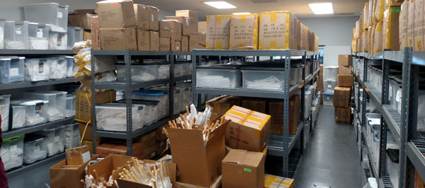
We moved into a bigger warehouse which was a much larger undertaking than we had anticipated. In addition, an unfortunate series of events forced us to move sooner rather than later.
Here’s what happened.
First off, we knew that our lease was going to end in 2016 and we negotiated the option to extend our stay on a month to month basis.
However, we were at max capacity and we had a container scheduled to arrive before the lease was up. So basically, we had 2 options.
We could stay at our existing office and store all of the new boxes at our house or we could quickly find a new warehouse and expedite the move.
We chose the latter option and bit off a little more than we could chew. During and after the move, there were linens everywhere and it took quite a while to get back to full strength.
I ended up turning off ads for a while until everything was sorted out and I did not feel comfortable trying to grow the business during this period.
Meanwhile, we had 2 new employees to train during the chaos and all of this happened just as the holiday season was rolling around.
But bottom line, we survived and we can now focus on growing again.
Anyway enough of the negative. Let’s talk about the improvements made this year shall we?
We Redesigned Our Site
I’m not going to go into too much depth about the exact changes I made to the site but in case you are interested, I documented our redesign in the following post.
The Exact Steps I Took To Increase Conversion Rates 42% For My Online Shop
Note: The conversion rates quoted in that post were based on only a few months worth of data. The numbers in this income report cover the entire second half of the year.
First off, I want to thank Mike Jackness, Andrew Youderian, Dana Jaunzemis, Lars Hundley, Tal Moore, Kevin Stecko, David Couillard and everyone else who totally demolished my site back in April and made me want to crawl in a hole and die.
It gave me the kick in the butt that I needed to take action and a good portion of this year’s growth can be attributed to it.
In my opinion, focusing on conversions was a better use of my time than simply trying to increase traffic because it boosted sales across all of my acquisition channels.
Why Mobile Conversions Shot Up 88%
After running the numbers, the biggest surprise were my mobile conversion numbers. If you look at the data shortly after my redesign, my mobile conversion rate wasn’t looking too good until I made 1 simple but significant tweak…
If you don’t know what I’m talking about, you can read about it below.
How An Easy Tweak Boosted Mobile And Tablet Conversion Rates By 31%
This was a game changer.
Almost immediately, mobile conversions shot up 31% and for the last 6 months, the conversion rate vs 2015 increased by 88%. Most of our traffic is mobile today so this is huge.
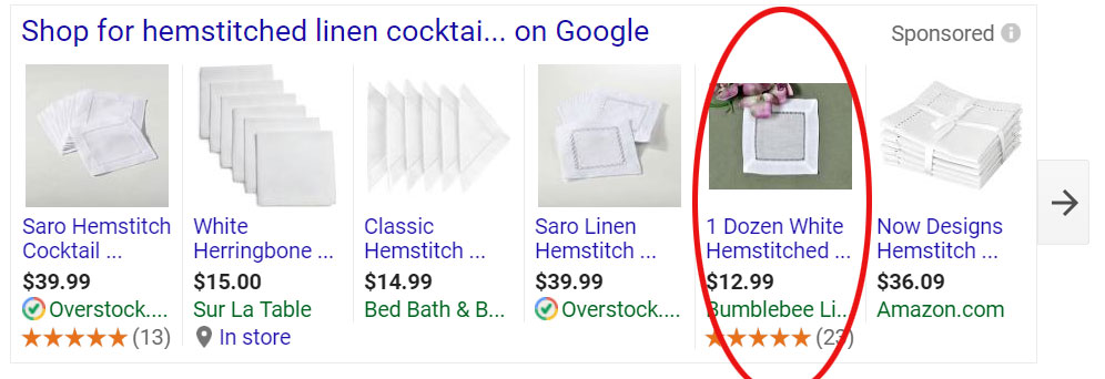
We Improved Our Google Shopping Ads
Google Shopping ads convert incredibly well for our store with a 5-6X ROAS so I didn’t think anything was wrong with them until I met Daniel Parker at ECF Live this year.
After talking to him, I discovered that I was missing out on more Google Shopping clicks because
- My feeds were not fully optimized
- I wasn’t uploading my product reviews to the Google Merchant center
- I wasn’t using structured markup on my pages
While it would take too long to discuss these items in depth in this income report, I plan on writing a separate post about this and Daniel Parker will be a guest on the podcast soon as well.
I Revamped My Email Autoresponders
For the longest time, I’ve been running my store with 2 primary autoresponders, an abandoned cart sequence, and a pre purchase sequence.
But last year, I added 3 more which have been converting sales that I otherwise would not have had
- Post-Purchase Sequence – I added a series of different email sequences that go out to paying customers depending on what they purchased. For example, someone who bought hankies would get a special “hankie” email sequence. Someone who bought napkins would get a special “napkin” sequence. This has resulted in a lot of repeat business
- Win-Back Campaigns – Borrowing this strategy from the incredible Drew Sanocki, I now send out coupons to customers who haven’t purchased in 60, 75 and 90 days with increasing discounts. If they end up purchasing, they no longer receive the subsequent coupons. This is called a discount ladder.
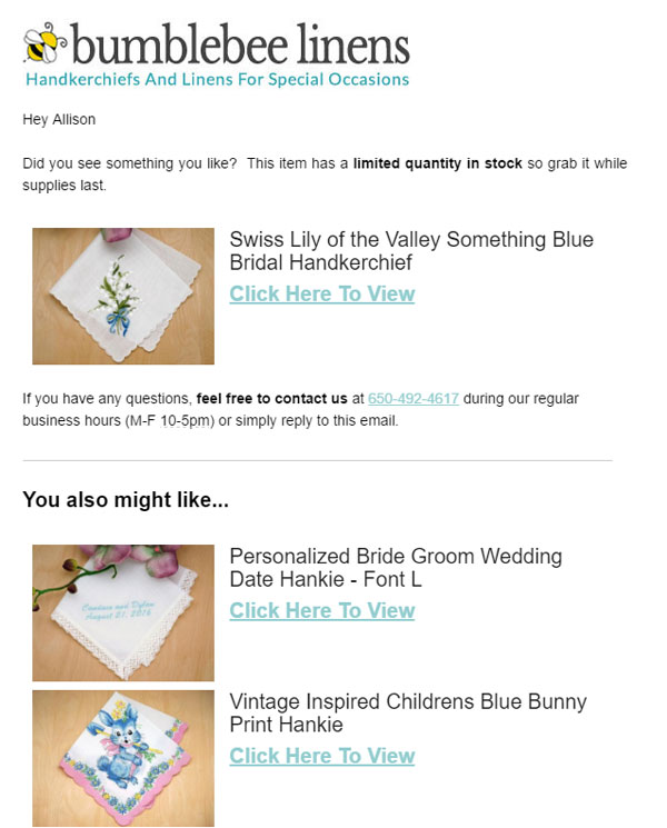
- Abandoned View Sequence – Once a customer is in the database, I send out product suggestions to anyone who is browsing the products on my site. This is different that my regular cart abandonment sequence because they get these emails without having to start checkout.
Here’s what an abandoned view email looks like from my store.
Overall, all of these emails have increased repeat purchases on autopilot!
Miscellaneous Fixes
During Black Friday/Cyber Monday, we were so swamped that I was forced to answer phone calls. And during that short period I learned that we had a bunch of usability issues with the new redesign.
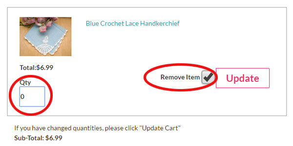
For one thing, people were having problems eliminating items from their shopping cart!
So I made 2 changes to fix this problem.
I made the “remove item” box bigger for desktop and mobile
I remove the item from the cart when the quantity is set to 0
These 2 changes have virtually eliminated this problem.
The second problem I fixed was much more subtle and annoyed the hell out of me until I finally figured out the fix.
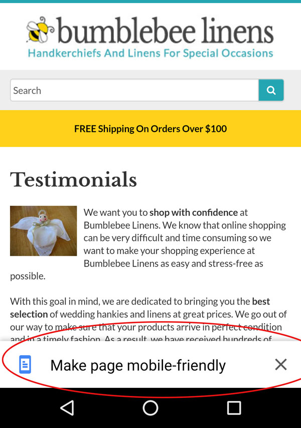
Have you ever seen this message on your Android phone before?
If so, you are probably annoying your customers on mobile. And if they end up clicking on that link as prompted? It ruins the formatting of your site.
Even though Google said that my site was mobile friendly using Google’s Mobile Optimized Tool, I still kept getting these messages and I had no idea why.
Looking closer at the problem, I determined that it was because my viewport settings were set to .8. By setting this to 1 or adding a “user scalable=no” parameter to your viewport, this fixed the problem.
Now I know this probably sounds like a bunch of gobbelty gook to you but if you are getting the dreaded “Make this site mobile friendly” message on an Android phone, ask your dev about your viewport settings.
Overall
Overall, I’m happy with the way the year went even though our traffic didn’t increase. One of the inherent problems with our business is that most customers buy once and then never come back unless they get a divorce:)
And one of the tasks for me this year is to find a solid customer base that I can tap over and over again.
We already have that with event and wedding planners but I also want to find a set of consumers that will be repeat buyers. Here’s to a successful 2017!
photo credit: quinet Malaysian Chinese abacus

Ready To Get Serious About Starting An Online Business?
If you are really considering starting your own online business, then you have to check out my free mini course on How To Create A Niche Online Store In 5 Easy Steps.
In this 6 day mini course, I reveal the steps that my wife and I took to earn 100 thousand dollars in the span of just a year. Best of all, it's free and you'll receive weekly ecommerce tips and strategies!
Related Posts In Our Story
- Behind The Scenes Of My First Ecommerce Conference – The Sellers Summit
- 25 Things You Don’t Know About The Wife Of MyWifeQuitHerJob.com
- My Keynote Speech For Sellers Summit 2017 And A Peek Behind The Scenes
- The Tradeoffs Of Owning Your Own Business Vs Working A Day Job
- How To Be More Productive – 8 Simple Habits To Get More Done

Steve Chou is a highly recognized influencer in the ecommerce space and has taught thousands of students how to effectively sell physical products online over at ProfitableOnlineStore.com.
His blog, MyWifeQuitHerJob.com, has been featured in Forbes, Inc, The New York Times, Entrepreneur and MSNBC.
He's also a contributing author for BigCommerce, Klaviyo, ManyChat, Printful, Privy, CXL, Ecommerce Fuel, GlockApps, Privy, Social Media Examiner, Web Designer Depot, Sumo and other leading business publications.
In addition, he runs a popular ecommerce podcast, My Wife Quit Her Job, which is a top 25 marketing show on all of Apple Podcasts.
To stay up to date with all of the latest ecommerce trends, Steve runs a 7 figure ecommerce store, BumblebeeLinens.com, with his wife and puts on an annual ecommerce conference called The Sellers Summit.
Steve carries both a bachelors and a masters degree in electrical engineering from Stanford University. Despite majoring in electrical engineering, he spent a good portion of his graduate education studying entrepreneurship and the mechanics of running small businesses.













Steve, I really like the abandoned view sequence. Please advise, what are the settings in Klaviyo so that it pulls in the item that the customer was viewing, and how are the suggested items picked? Thanks.
Another solid report! Your experiences this year have really been interesting to me. Amazing how such little things have such big responses!! And yes, that “make mobile friendly” thing always ticks me off when I see it :/ here is to another solid year of growth to you guys 🙂
Your increase in conversion rates seems very impressive. but you never say what your conversion rates are. Can you tell me what your conversions rates are currently? When mobile conversions increase by 88%, was that 1% to 1.88%? or from 3% to 5.44%?