
Out of all the traffic sources that bring in revenue to MyWifeQuitHerJob.com, most of the money that I make is derived directly from my email list. Without my email list, I would not be selling very many copies of my ecommerce course.
Without my email newsletter, I wouldn’t be converting nearly as many affiliate offers. And without email, I would not be receiving as much traffic as I currently receive today.
Because email is such a crucial part of my blogging business, it’s important for me to maximize the size and quality of my email list. So today, I wanted to teach you how to build an email list and share with you 2 very minor tweaks that I recently made to my site that have doubled my daily number of email signups.
Both of these these tweaks took me about 30 minutes to make and they are guaranteed to make a huge difference in your signup volume.
Get My Free Mini Course On How To Start A Successful Ecommerce Store
If you are interested in starting an ecommerce business, I put together a comprehensive package of resources that will help you launch your own online store from complete scratch. Be sure to grab it before you leave!
Table of Contents
Change #1: I Made My Signup Form Blend In With The Content
The first technique I’m going to describe is what I call the “Turner Technique” named after Brandon Turner of BiggerPockets.com. Now Brandon emailed me randomly one day and told me about their latest split test results for their email form. Here’s what he said…
By moving the bio box down, moving the signup form up and taking the border off, we managed to increase our email signups by over 3X! You should try it Steve!
First off, I was floored by their split test results so as soon as I got home I decided to implement this tactic on my site. Here’s a “before” picture of my site.
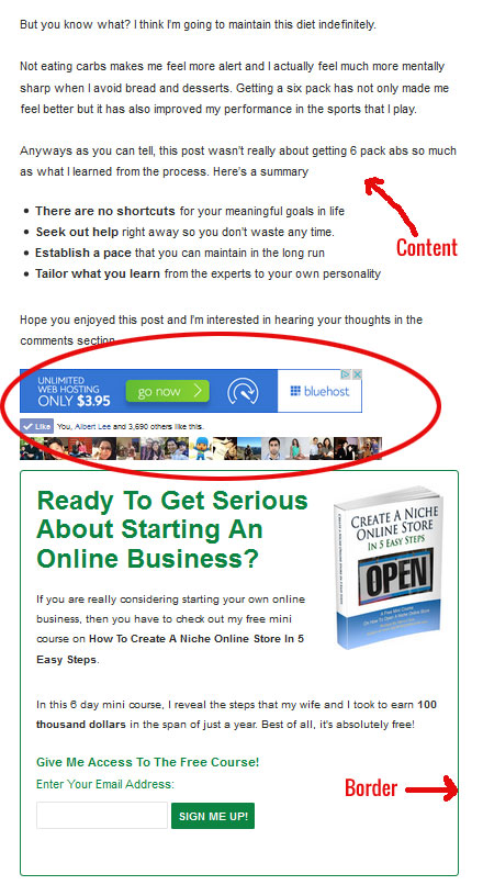
Here’s What You Should Pay Attention To Above:
- There’s a Facebook Like Box that is standing in the way between the content and the signup form
- There’s a dark green border around the signup form that is ironically causing form blindness
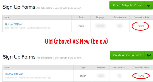
After moving the Facebook Like Box below the signup form and removing the dark green border, the results were immediately obvious. As you can see from the picture below, the conversion rate for this signup form went from .6% to 1.2% which is double!
Note: I let the test run for almost a month and there were no traffic anomalies during this period.
Change #2: I Switched From Double To Single Optin
The second change that I made was a very controversial one and many people have differing opinions on which method to use. Here’s my take on the whole double optin vs single optin debate and a few facts that you might not be aware of.
One of the biggest fears of going single optin vs double optin is the increased spam. And yes, this is true. By going single optin, you will likely encounter more spam email addresses than with double optin.
However did you know that email providers like Aweber have counter measures in place to combat spam for single optin forms? For example, if someone is trying to submit multiple email addresses to your forms with the intention of spamming people, Aweber will detect this and automatically switch your form to double optin.
In other words, Aweber won’t let the same IP address submit multiple email addresses. This in itself cuts down on potential spam from bots.
Now there have been many reports out there that using double optin increases open and click through rates dramatically and yes, this is true. However, these articles make absolutely no mention of how many more signups would have been obtained from single versus double optin to offset the decrease.
In order to figure out what email optin solution works the best, you have to do your own experiments which is why I decided to let the data make my decision. Note: Both experiments below were conducted without change #1 in place.
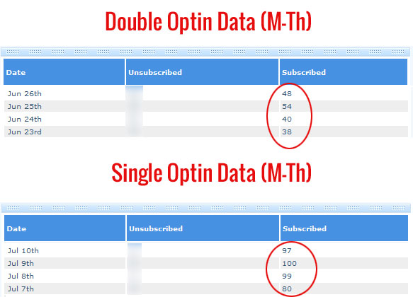
First off, here’s what my number of daily signups looks like for double vs single optin. As you can see below, the number of signups for single vs double optin is roughly 2X or a 109% higher for single optin.
Now it’s one thing to have more subscribers but we also need to check how engaged the single optin subscribers are versus the double optin subscribers. Does having double the number of signups offset the impact of less email opens from a single optin list? Let’s find out.
Here’s what my open rate looks like for the first email in my autoresponder sequence.
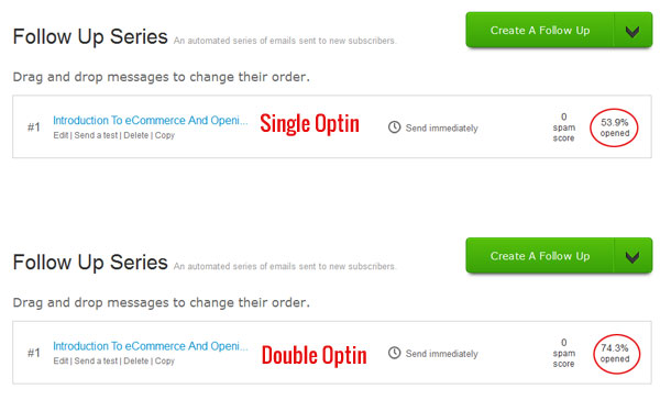
As you can see above the open rate for my double optin list is indeed higher than my single optin list at 74.3% vs 53.9%. Ok. Now let’s do some simple math.
By tallying up all of the signups for single optin in the table above, we get 376 subscribers * 53.9% = 202.66.
By tallying up all of the signups for double optin in the table above, we get 180 subscribers * 74.3% = 133.74.
Therefore, going single optin has improved my effective email list size by 51.3%.
Future Improvements To My Email Signup Forms
So far the 2 simple changes I described above have really improved my email list growth, but it can always be better. After talking to some other bloggers, it seems as though my front page banner signup form is converting a little bit on the low end.
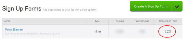
According to others in my same niche, a properly designed front banner form should convert well into the double digits so I decided to run a little Crazy Egg experiment on my front page. Here’s what I found out.
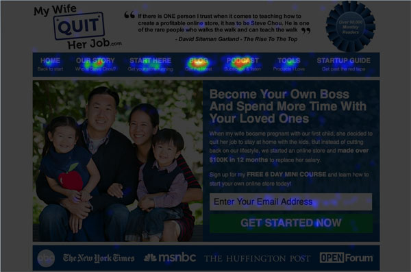
From the heatmap above, it is very clear that my signup form is hurting. Because there is all of this extra navigation at the top, people are being diverted away from the form and to the other pieces of content on my blog.
This isn’t necessarily a bad thing but I know that I could definitely boost conversions by removing the nav bar and having only 1 call to action on the front landing page. In any case, I’ll be doing some experiments on this and will let you know the results.
Sign up for my free newsletter at the end of this post to stay up to date on any future email experiments.
Conclusion
When it comes to increasing the number of email signups to your newsletter, you should never just blindly listen to other people or follow random articles on the web. Instead, you should sit down and test your website to see what works and what does not.
A Quick Note: All of the experiments that I conducted above were simple to execute because my email provider Aweber allows you to easily test the performance of different email forms within a single list.
If you are using a free email provider like Mailchimp, these experiments are slightly harder to set up because you can’t measure different forms within the same list.
In any case after running these experiments, I thought that I’d share with you how well the different email forms perform on my blog. After implementing the “Turner Technique”, the signup form below my content easily became the top converting form on my entire website.
My second best signup form is my popup followed by my sidebar. If you haven’t already done so, you should definitely go ahead and install a popup form on your site. And for that I recommend a few plugins.
Privy is a free plugin that allows you to try different experiments with your popups to see what works best. For example, you can use Privy to figure out the optimal time to wait before showing your popup in order to maximize conversions.
Either way, you should install a popup form if you value your newsletter signups.
What Are You Using?
Now I need a favor from you. I’m curious, how many of you are using single optin vs double optin on your site and how do your conversion numbers compare to mine?
Please share in the comments below and I’ll collate the data.