When it comes to running any online business, tracking visitor behavior and testing your conversion funnels are essential for improving your sales. Most webmasters rely on the free tool, Google Analytics, to track the overall statistics for their sites.
But while Google Analytics is an extremely powerful tool, it does not provide enough information to give you a clear picture of how a visitor interacts with your site. For example…
- Google Analytics does not tell you which exact buttons and links a person is clicking on a given page.
- Google Analytics does not tell you which portions of your webpage are the most read.
- Google Analytics does not tell you if people are scrolling all the way down and reading all of your content.
In a nutshell, Google Analytics alone does not provide with you with enough information to improve your website.
Get My Free Mini Course On How To Start A Successful Ecommerce Store
If you are interested in starting an ecommerce business, I put together a comprehensive package of resources that will help you launch your own online store from complete scratch. Be sure to grab it before you leave!
Track The Exact Activity Of Your Visitors
Ever since 2011 when I first launched my online store course, I’ve been using a tool called Crazy Egg to help improve my webpages. Unlike Google Analytics, Crazy Egg allows you to visualize exactly how a customer is interacting with your website.
For example, the tool allows you to create heatmaps to see where your customers are clicking on your site.
Update: I’m now using a tool called Mouse Flow which lets you record and watch videos of your customers in action in addition to heat maps and scroll maps! Plus it’s substantially cheaper than CrazyEgg as well!
Click here to try MouseFlow free for 30 days
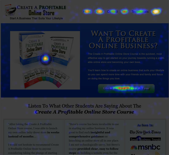
The picture below shows what visitors are clicking on when they land on my sales page. As you can see, there is heavy clicking on the “Click Here To Take A Tour” button which is exactly what I want.
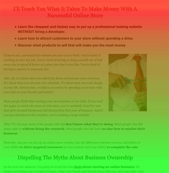
Both Crazy Egg and Mouse Flow also provides you with a scroll map which allows you to determine which parts of your page are actually being read. The picture below clearly displays which portions of my page are more popular.
The yellow and red portions of the page are “hot” while the green and blue areas are areas where the visitor is not as engaged with the content.
Anyways if you have ever tried to sell something online, you can probably understand why using a tool like this can be invaluable in understanding customer behavior and allowing you to make the necessary tweaks to guide your visitors in the right direction.
A Personal Story
So here’s where it gets a little embarrassing for me:) While I’ve been using these tools pretty heavily to optimize my blog and landing pages, I didn’t start using the tool on my ecommerce store until last year.
So I thought that I would take some time to share with you a test that I recently conducted that reduced the number of support calls to our store and boosted conversions by 9.3%.
And the only reason I decided to make changes to the page was because of data I collected using tools like Crazy Egg and Mouse Flow
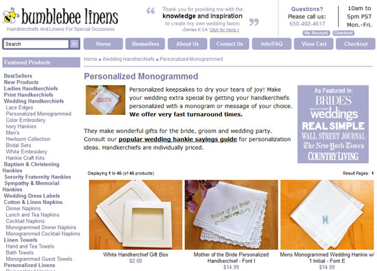
Shown below is how one of our top landing pages looked like a long time ago.
Here’s a little background story behind the page design. In our store, we sell personalized handkerchiefs. We offer 14 different styles of handkerchiefs and 14 thread colors to choose from and a customer can basically customize their handkerchief however they want.
The problem however was that customers kept getting confused by the product selection because they thought that they were stuck with the handkerchief “displayed in the photo” and not allowed a choice of different styles or thread colors.
So we would get lots of phone calls from people asking how to personalize a handkerchief and whether they could personalize a different handkerchief than what was shown in the photo etc…
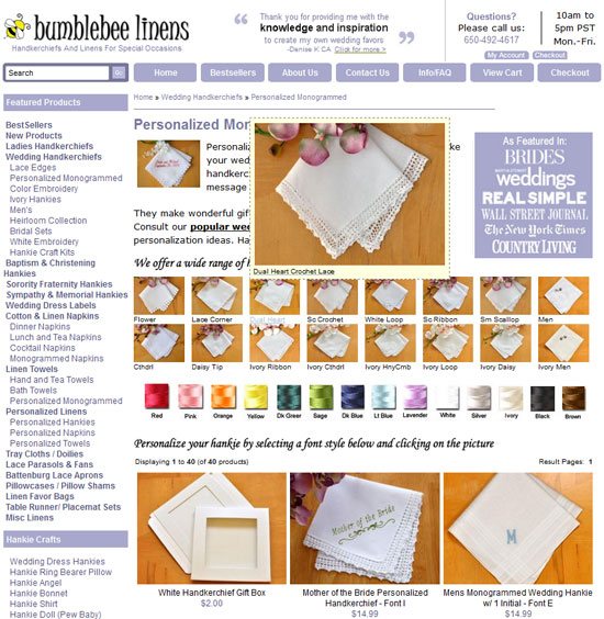
Anyways, to prevent confusion I added a picture of all of the handkerchiefs that you could personalize at the top of the page which would then expand into a larger picture when you hovered your mouse over a particular handkerchief. I also added a thread chart.
Shown below is the 2nd iteration of the same page.
The idea was that the customer would notice right away that they had a large variety of handkerchiefs to choose from when adding personalization so they wouldn’t get confused and leave.
But even after this change, we still kept periodically receiving very basic questions over the phone like “How do I personalize my handkerchief?”.
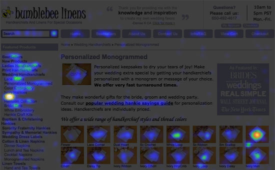
Anyways, I knew our user interface still had some problems but I left it alone for the longest time because the page was still converting very well (between 3-7%). But since these products are one of our big money makers, I decided to use Crazy Egg and this is what I noticed.
Can you spot the problem here? Customers were actually clicking on those little pictures even though they weren’t links! Could it be that customers were clicking there expecting something to happen?
So after seeing the heatmap, I invited a friend who had never shopped at our store to try and buy a personalized hankie. And low and behold, she started clicking on those photos too!
She had assumed that by clicking on the small photo that she’d be taken to another page where she could then personalize her handkerchief. She was also confused by the whole personalization process because there were no clear instructions.
Note: I think part of the reason she got confused was because those little hankie pictures were above the fold and the “real” products were hidden below the fold on her laptop. This was a real problem!
Anyways, I had somewhat of a dilemma. If I included directions on how to personalize a hankie at the top of the page, that would have pushed all of the products further down below the fold which would not have been desirable.
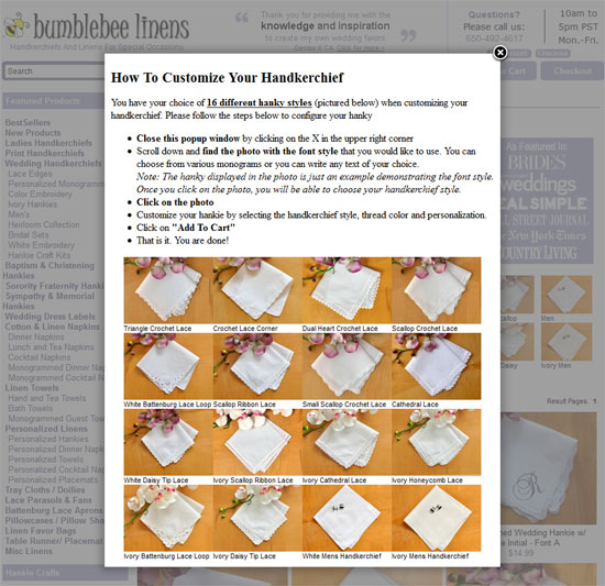
So ultimately, I decided to create a small informational popup that displayed when anyone clicked on one of those little pictures. And on this popup, I provided specific directions on how to personalize a handkerchief. In addition, I removed the thread color graphic to move our products up on the page. Here’s an example below.
After adding the popup and doing some split testing with the original landing page, I found that adding the popup and moving the products higher on the page increased conversions by about 9.3% but most importantly, we haven’t received a support call about this since.
Even though this page still needs work, I was ecstatic to find a trouble spot with our landing page which I was able to spot immediately with heat map analysis. With just regular Google Analytics, I would never have observed this behavior.
Lessons Learned
If you take anything away from this post, it’s that Google Analytics does not provide enough information to improve your conversions if you run any sort of transactional based site.
Analyzing customer behavior is important and it’s crucial to not only know which customers are visiting but how they are interacting your page as well.
Running an online store is about as transactional as it gets so I recommend that all ecommerce stores think beyond analytics and observe their customers at a much finer grained level.
The best part is that you can click here to try these tracking tools for free for 30 days.
Feel free to ask me any questions below.

Ready To Get Serious About Starting An Online Business?
If you are really considering starting your own online business, then you have to check out my free mini course on How To Create A Niche Online Store In 5 Easy Steps.
In this 6 day mini course, I reveal the steps that my wife and I took to earn 100 thousand dollars in the span of just a year. Best of all, it's free and you'll receive weekly ecommerce tips and strategies!
Related Posts In Conversion Optimization
- How To Find The Optimal Price To Charge For Your Products
- Website Migration: The Risks Involved And How Not To Screw It Up
- Shopify Google Analytics – An Easy To Follow Guide For Ecommerce Store Owners
- How To Write A Killer Product Description (Templates And Examples Included)
- 5 Ingenious Sales Tactics That Disney World Uses That Can Be Applied To Your Ecommerce Store

Steve Chou is a highly recognized influencer in the ecommerce space and has taught thousands of students how to effectively sell physical products online over at ProfitableOnlineStore.com.
His blog, MyWifeQuitHerJob.com, has been featured in Forbes, Inc, The New York Times, Entrepreneur and MSNBC.
He's also a contributing author for BigCommerce, Klaviyo, ManyChat, Printful, Privy, CXL, Ecommerce Fuel, GlockApps, Privy, Social Media Examiner, Web Designer Depot, Sumo and other leading business publications.
In addition, he runs a popular ecommerce podcast, My Wife Quit Her Job, which is a top 25 marketing show on all of Apple Podcasts.
To stay up to date with all of the latest ecommerce trends, Steve runs a 7 figure ecommerce store, BumblebeeLinens.com, with his wife and puts on an annual ecommerce conference called The Sellers Summit.
Steve carries both a bachelors and a masters degree in electrical engineering from Stanford University. Despite majoring in electrical engineering, he spent a good portion of his graduate education studying entrepreneurship and the mechanics of running small businesses.


Hey Steve,
Good advice as often is the case from you. Understanding your customers/visitors to your site(s) is crucial to being and remaining in touch and effective. Anything that helps you achieve this is very welcome indeed.
This was really helpful for me. I am having the same problem with my personalized products. I’m trying out different things, but I like the pop up idea. I am also making a video to do a walk thru that shows how to personalize (as a mix of screen share and real product photos) and hoping that helps customers understand what to do to get what they want. Thanks for the suggestion!
Hi Steve,
Is this app available if we run a store on Shopify?
Thanks
I have heard about Crazy Egg for a long time but have never used it for any of my sites. After reading this case study, it makes sense that I need to apply this to my main site. This also makes me more curious about trying/testing new things on my site to get the best conversion rate possible.
Thanks for sharing!
Crazy Egg now has a A/B testing feature as well as recordings! 🙂