As part of running my online store course, I’ve seen more than my fair share of poorly designed websites.
But here’s the thing.
Designing a high converting website is one of the hardest aspects of selling online.
Not only do you have to step inside your customer’s brain and speak his or her language but you also have to guide them to the right product and close the sale.
After critiquing almost a hundred websites over the course of running my online store course, I’ve discovered that most people make the same fundamental mistakes with their site design.
Here are the most common problems and how to fix them.
Get My Free Mini Course On How To Start A Successful Ecommerce Store
If you are interested in starting an ecommerce business, I put together a comprehensive package of resources that will help you launch your own online store from complete scratch. Be sure to grab it before you leave!
Mistake #1: No One Can Tell What You Sell
You should always design your website with the assumption that no one knows who you are or what you sell. In fact, when someone lands on your site for the first time, you have about 5 seconds to educate them or they’ll leave.
After all, if they don’t know what your product does, then they aren’t going to buy. Seems obvious right? But there are so many store owners that get it wrong.
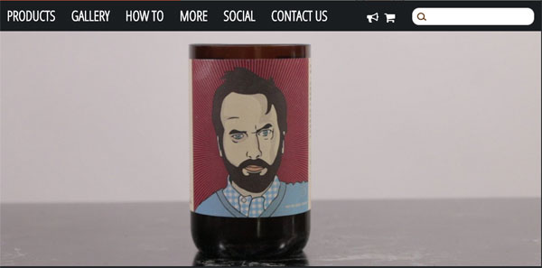
For example based on this splash image, can you tell what this shop sells?
Neither can I. And even though this online store gets a good amount of traffic, you have to dig deep into their site to figure out how their product works.
Bottom line. The imagery and verbiage you use on your site must be self explanatory. If you use a single splash image with no words on your front page, the image better speak for itself.
Mistake #2: You Don’t Have A Clear Value Proposition
In addition to telling customers what you sell, you also have to convey your unique value proposition. Here are the questions you need to answer as soon as someone visits your site.
- What makes your product special?
- What are your key benefits?
- Why should people shop in your store versus a competitor?
First off, let’s make this clear. Describing your value proposition with words like “high quality” or “best” or “great customer service” is not going to cut it
After all, the term “high quality” is ambiguous. Why is your product high quality? Why is it the best?
The most powerful value propositions send a clear message and contain the following elements.
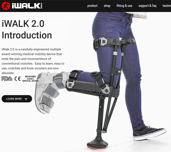
1. A large, beautiful image that shows your item in use and clearly demonstrates value and desire.
After tearing my achilles, I knew I had to have this as soon as I saw it.
2. A simple tag line that uses simple, clear language to communicate why your product is worth buying.
Saddleback Leather – Bags so tough, they’ll fight for it when you’re dead
3. Bullet points that support the tag line and reinforce why your store is the best choice.
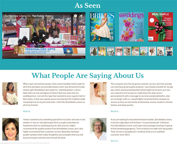
4. Social proof – Magazines, testimonials and media mentions add credibility to your business.
Mistake #3: You Have A Cluttered Design And/Or A Busy Background
Every page on your website should have a primary objective. And the path to this objective should be straightforward.
The problem with busy backgrounds and clutter is that it obscures your main call to action.
Always be stingy with your design elements because every widget, graphic and button that you add could distract the user.
Remember, less is more and the goal of every webpage should be clear.
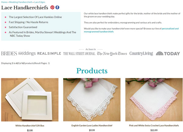
For example on my home page, my primary goal is to get a visitor to click on the big pink button which takes them to our highest margin products.
The primary objective on my category page is to get a visitor to view a product.
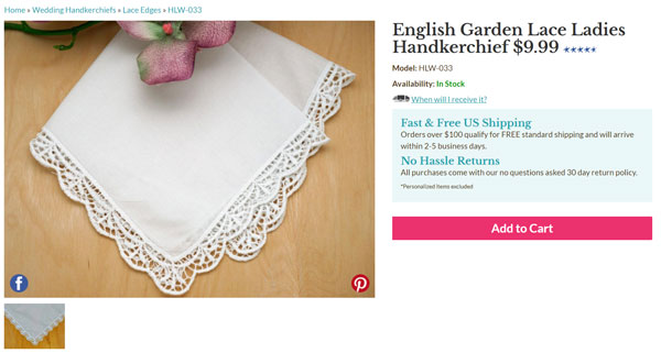
And the main goal of my product page is to get people to click on “add to cart”
Note: I purposely use hot pink for all of my main action buttons because the color pops out of the page.
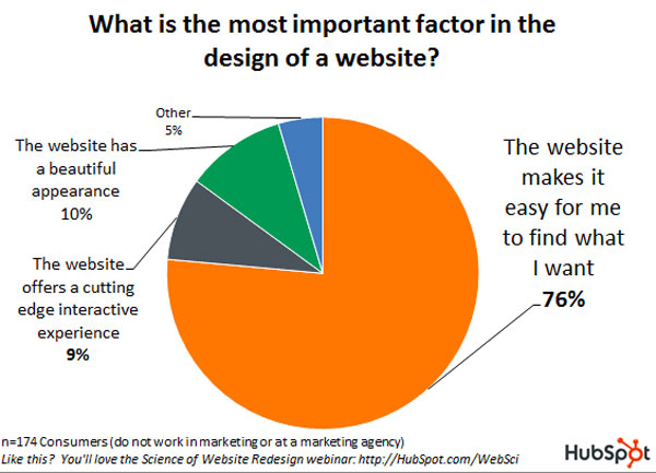
When it comes to high converting websites, usability always trumps aesthetics.
According to a survey conducted by HubSpot, 76% of customers prefer easy navigation over beauty.
Keep this statistic in mind as you shop for themes. Because a beautiful site doesn’t necessarily translate to sales.
In fact, most of the beautiful store themes out there are designed by artists and not optimized to make money!
Mistake #4: You’re Using Poor Quality Photos And/Or Small Images
The main driver of sales for your online store will be your images. So make sure that your photos are as large and clear as possible.
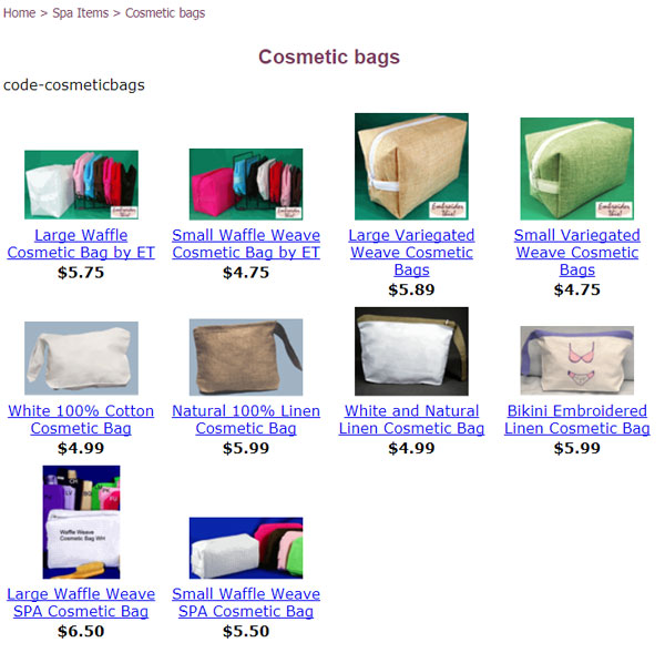
For example, this store could easily improve conversions by quadrupling the size of its images and making them all uniform in size.
Image quality is crucial as well. Make sure that your photos are well lit and taken on a plain background for maximum pop.
For more information on taking great photos, consult this post
Mistake #5: Your Site Is Not Trustworthy
In order for someone to open up their wallet, they have to trust your site. In fact, lack of trust is the #1 conversion killer for ecommerce stores.
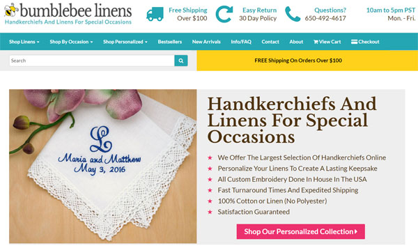
To increase buyer confidence, you should have your contact information front and center on every single page of your site. Also, make sure you display both a physical address AND a phone number.
It doesn’t matter if you don’t plan on answering the phone. Having a number will increase the credibility of your shop. In addition, clearly marked store hours imply that you have a real business with a fixed schedule of operation.
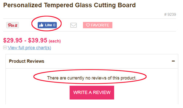
If your store is brand new, make sure you don’t accidentally drive away customers with negative social proof.
For example, if you have products with zero likes and zero reviews, don’t show social counts!
However, if you have testimonials and press mentions for your business, display them prominently on every single page of your site.
In my last redesign, I implemented many additional trust factors for my shop which improved my conversion rate by 42%.
Read my post on The Exact Steps I Took To Increase Conversion Rates 42% For My Online Shop to learn more.
Mistake #6: You’re Not Setup For SEO
If you want to have any chance at all of ranking in the search engines, you have to choose the right keywords for your products.
At a bare minimum, you should populate the title tags for your pages with relevant search terms that directly pertain to what you’re selling.
Before you publish any product online, you should use a tool like Long Tail Pro to discover which keywords are most commonly being used to search for your products.
Go after the highest volume, lowest competition keywords to give yourself the best chance of ranking in search.
If you are not already doing this with your store, definitely check out Long Tail Pro or the Google Keyword Planner.
Then, go through every money making page on your site and optimize your title tags and meta descriptions.
Mistake #7: Your Onsite Search Doesn’t Work
Most people focus so much on ranking on Google that they neglect to work on their own on site search engine.
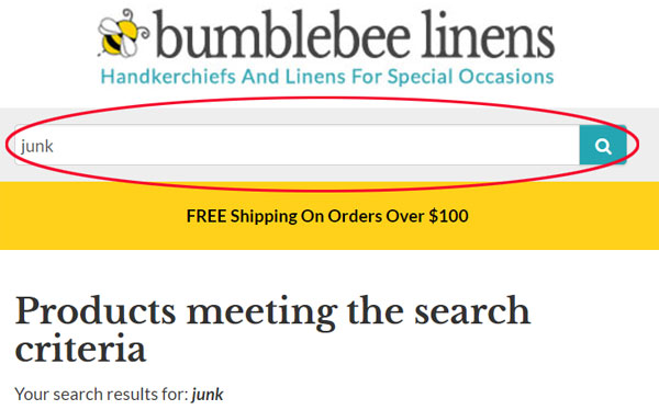
Depending on the number of products you sell in your shop, up to 30% of your customers will immediately jump to the search bar on your site.
And guess what?
If they don’t find what they are looking for, they will leave immediately. I’ve written about this topic extensively in the past already.
Read this post, if you want to learn exactly how to optimize your on site search.
Mistake #8: Your Site Is Not Mobile Optimized
Starting in late 2015, my mobile traffic started overtaking my desktop traffic. And chances are, your traffic patterns will be similar.
Mobile has become such an important factor for my business that I now design my website for smart phones first BEFORE considering desktops and laptops.
I’ve written many articles in the past about mobile design, so rather than repeat myself, I’ve linked all relevant posts below.
- How An Easy Tweak Boosted Mobile And Tablet Conversion Rates By 31%
- How To Organize Your Mobile Website To Maximize Usability And Sales
- Making Forms Mobile Friendly And How IPhone AutoCorrect Almost Cost Us A Big Order
- How To Design A Killer Mobile Ecommerce Website That Will Boost Sales
Mistake #9: You Are Careless With Your Site
Have you ever actually shopped on your own website? Most shop owners obsessively check their Google Analytics stats but rarely set foot in their own store.
In order to fully optimize your shopping experience, you have to be your own customer.
Routinely in my Create A Profitable Online Store Course, I pretend to be a shopper and conduct full website critiques for the students in my class.
And more often than not, I find careless mistakes littered all over the site.
Here are some common ones.
- Grammatical Errors – You should go through every critical page on your website with a fine tooth comb for spelling and grammatical mistakes.
- Broken Images – Click through every single page on your site and make sure all images are populated.
- Slow Loading Pages – I once critiqued a site that took 25 seconds to load! And the reason was because the student inadvertently used full resolution photos (3MB each)
- Too Many Popups – Make note of any major annoyances while shopping. For example, if you are showing a popup on every single page, you should stop
- Auto Play Video – Don’t force customers to listen to a sales pitch or a speech recording. When I see an autoplay video, I usually leave the site immediately, especially if I can’t figure out how to turn it off.
Conclusion
When it comes website design, most people place too much emphasis on aesthetics.
Just because you’ve purchased an attractive store theme and you’re using a fully hosted shopping cart like Shopify and Big Commerce doesn’t mean you’ll make sales.
The best way to improve your conversion rate is to solicit third party feedback and get an unbiased opinion about your store.
- Is your store trustworthy?
- Is the product appealing?
- Would you shop there?
If you can convey your value proposition clearly, you’ll be successful.

Ready To Get Serious About Starting An Online Business?
If you are really considering starting your own online business, then you have to check out my free mini course on How To Create A Niche Online Store In 5 Easy Steps.
In this 6 day mini course, I reveal the steps that my wife and I took to earn 100 thousand dollars in the span of just a year. Best of all, it's free and you'll receive weekly ecommerce tips and strategies!
Related Posts In Conversion Optimization
- PayPal One Touch – How This One Feature Increased Mobile Conversion Rates By 31%
- How To Increase Your Amazon Sales Rank By 209% With A Simple Photo Tweak
- Common Mistakes New Online Store Owners Make That Prevent Them From Ever Being Profitable
- Should I Buy A Cheap SSL Certificate Vs A Name Brand Like Verisign Or GeoTrust And Is EV Necessary?
- How To Find The Optimal Price To Charge For Your Products

Steve Chou is a highly recognized influencer in the ecommerce space and has taught thousands of students how to effectively sell physical products online over at ProfitableOnlineStore.com.
His blog, MyWifeQuitHerJob.com, has been featured in Forbes, Inc, The New York Times, Entrepreneur and MSNBC.
He's also a contributing author for BigCommerce, Klaviyo, ManyChat, Printful, Privy, CXL, Ecommerce Fuel, GlockApps, Privy, Social Media Examiner, Web Designer Depot, Sumo and other leading business publications.
In addition, he runs a popular ecommerce podcast, My Wife Quit Her Job, which is a top 25 marketing show on all of Apple Podcasts.
To stay up to date with all of the latest ecommerce trends, Steve runs a 7 figure ecommerce store, BumblebeeLinens.com, with his wife and puts on an annual ecommerce conference called The Sellers Summit.
Steve carries both a bachelors and a masters degree in electrical engineering from Stanford University. Despite majoring in electrical engineering, he spent a good portion of his graduate education studying entrepreneurship and the mechanics of running small businesses.











Thanks for sharing this. I am planning to start an e commerce site for embroidery design.Hope this will be a great help to me.
Rightly said, I am running an online store and below are the two mistakes that i am making.
1. Careless about Online Store
2. Website Design
I am using Prestashop for my online store but did not find any good theme for my site ( one which has a good placement of Adsense units)
Anyway, nice post and agree with the mistakes mentioned over here.
Hey Steve, awesome stuff! Nowadays I have noticed that so many shops are doing this kind of eCommerce design mistakes. Just like some days ago I visited an eCommerce store for buying, mobile and you don’t believe there checkout Process was very Long and Confusing. I suppose all the merchants should make website user-friendly and easy to accessible whereby customers would like to visit again.
Hey now – I actually like it when I come across a site that uses some sort of super busy pattern for its background, because it makes me feel like I’m living in the 90’s again 😉
I have to make sure people know what I sell, great tip! Will make sure to make that happen.