Out of all the traffic sources that bring in revenue to MyWifeQuitHerJob.com, most of the money that I make is derived directly from my email list. Without my email list, I would not be selling very many copies of my ecommerce course.
Without my email newsletter, I wouldn’t be converting nearly as many affiliate offers. And without email, I would not be receiving as much traffic as I currently receive today.
Because email is such a crucial part of my blogging business, it’s important for me to maximize the size and quality of my email list. So today, I wanted to teach you how to build an email list and share with you 2 very minor tweaks that I recently made to my site that have doubled my daily number of email signups.
Both of these these tweaks took me about 30 minutes to make and they are guaranteed to make a huge difference in your signup volume.
Get My Free Mini Course On How To Start A Successful Ecommerce Store
If you are interested in starting an ecommerce business, I put together a comprehensive package of resources that will help you launch your own online store from complete scratch. Be sure to grab it before you leave!
Change #1: I Made My Signup Form Blend In With The Content
The first technique I’m going to describe is what I call the “Turner Technique” named after Brandon Turner of BiggerPockets.com. Now Brandon emailed me randomly one day and told me about their latest split test results for their email form. Here’s what he said…
By moving the bio box down, moving the signup form up and taking the border off, we managed to increase our email signups by over 3X! You should try it Steve!
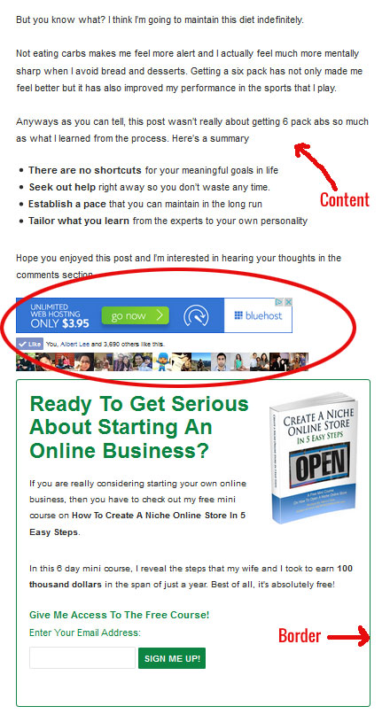
First off, I was floored by their split test results so as soon as I got home I decided to implement this tactic on my site. Here’s a “before” picture of my site.
Here’s What You Should Pay Attention To Above:
- There’s a Facebook Like Box that is standing in the way between the content and the signup form
- There’s a dark green border around the signup form that is ironically causing form blindness
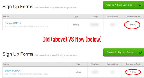
After moving the Facebook Like Box below the signup form and removing the dark green border, the results were immediately obvious. As you can see from the picture below, the conversion rate for this signup form went from .6% to 1.2% which is double!
Note: I let the test run for almost a month and there were no traffic anomalies during this period.
Change #2: I Switched From Double To Single Optin
The second change that I made was a very controversial one and many people have differing opinions on which method to use. Here’s my take on the whole double optin vs single optin debate and a few facts that you might not be aware of.
One of the biggest fears of going single optin vs double optin is the increased spam. And yes, this is true. By going single optin, you will likely encounter more spam email addresses than with double optin.
However did you know that email providers like Aweber have counter measures in place to combat spam for single optin forms? For example, if someone is trying to submit multiple email addresses to your forms with the intention of spamming people, Aweber will detect this and automatically switch your form to double optin.
In other words, Aweber won’t let the same IP address submit multiple email addresses. This in itself cuts down on potential spam from bots.
Now there have been many reports out there that using double optin increases open and click through rates dramatically and yes, this is true. However, these articles make absolutely no mention of how many more signups would have been obtained from single versus double optin to offset the decrease.
In order to figure out what email optin solution works the best, you have to do your own experiments which is why I decided to let the data make my decision. Note: Both experiments below were conducted without change #1 in place.
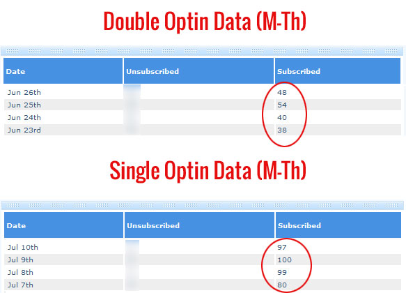
First off, here’s what my number of daily signups looks like for double vs single optin. As you can see below, the number of signups for single vs double optin is roughly 2X or a 109% higher for single optin.
Now it’s one thing to have more subscribers but we also need to check how engaged the single optin subscribers are versus the double optin subscribers. Does having double the number of signups offset the impact of less email opens from a single optin list? Let’s find out.
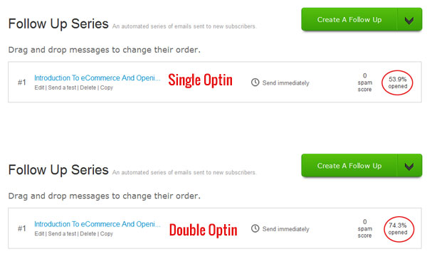
Here’s what my open rate looks like for the first email in my autoresponder sequence.
As you can see above the open rate for my double optin list is indeed higher than my single optin list at 74.3% vs 53.9%. Ok. Now let’s do some simple math.
By tallying up all of the signups for single optin in the table above, we get 376 subscribers * 53.9% = 202.66.
By tallying up all of the signups for double optin in the table above, we get 180 subscribers * 74.3% = 133.74.
Therefore, going single optin has improved my effective email list size by 51.3%.
Future Improvements To My Email Signup Forms
So far the 2 simple changes I described above have really improved my email list growth, but it can always be better. After talking to some other bloggers, it seems as though my front page banner signup form is converting a little bit on the low end.
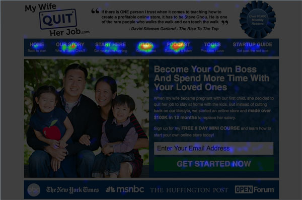
According to others in my same niche, a properly designed front banner form should convert well into the double digits so I decided to run a little Crazy Egg experiment on my front page. Here’s what I found out.
From the heatmap above, it is very clear that my signup form is hurting. Because there is all of this extra navigation at the top, people are being diverted away from the form and to the other pieces of content on my blog.
This isn’t necessarily a bad thing but I know that I could definitely boost conversions by removing the nav bar and having only 1 call to action on the front landing page. In any case, I’ll be doing some experiments on this and will let you know the results.
Sign up for my free newsletter at the end of this post to stay up to date on any future email experiments.
Conclusion
When it comes to increasing the number of email signups to your newsletter, you should never just blindly listen to other people or follow random articles on the web. Instead, you should sit down and test your website to see what works and what does not.
A Quick Note: All of the experiments that I conducted above were simple to execute because my email provider Aweber allows you to easily test the performance of different email forms within a single list.
If you are using a free email provider like Mailchimp, these experiments are slightly harder to set up because you can’t measure different forms within the same list.
In any case after running these experiments, I thought that I’d share with you how well the different email forms perform on my blog. After implementing the “Turner Technique”, the signup form below my content easily became the top converting form on my entire website.
My second best signup form is my popup followed by my sidebar. If you haven’t already done so, you should definitely go ahead and install a popup form on your site. And for that I recommend a few plugins.
Privy is a free plugin that allows you to try different experiments with your popups to see what works best. For example, you can use Privy to figure out the optimal time to wait before showing your popup in order to maximize conversions.
Either way, you should install a popup form if you value your newsletter signups.
What Are You Using?
Now I need a favor from you. I’m curious, how many of you are using single optin vs double optin on your site and how do your conversion numbers compare to mine?
Please share in the comments below and I’ll collate the data.

Ready To Get Serious About Starting An Online Business?
If you are really considering starting your own online business, then you have to check out my free mini course on How To Create A Niche Online Store In 5 Easy Steps.
In this 6 day mini course, I reveal the steps that my wife and I took to earn 100 thousand dollars in the span of just a year. Best of all, it's free and you'll receive weekly ecommerce tips and strategies!
Related Posts In Email Marketing
- 16 Strategies To Avoid The Gmail Spam Folder And Promotions Tab
- How To Be GDPR Compliant For Ecommerce Stores – A Concise Summary Of What You Need To Do
- Mailchimp Pricing – The Best And Cheapest Plan For Your Money
- A Free Email Marketing Service To Grow Your List – A Tour Of My New Business
- The Abandoned Cart Email Sequence That Recovers 19% Of My Sales (Without A Coupon)

Steve Chou is a highly recognized influencer in the ecommerce space and has taught thousands of students how to effectively sell physical products online over at ProfitableOnlineStore.com.
His blog, MyWifeQuitHerJob.com, has been featured in Forbes, Inc, The New York Times, Entrepreneur and MSNBC.
He's also a contributing author for BigCommerce, Klaviyo, ManyChat, Printful, Privy, CXL, Ecommerce Fuel, GlockApps, Privy, Social Media Examiner, Web Designer Depot, Sumo and other leading business publications.
In addition, he runs a popular ecommerce podcast, My Wife Quit Her Job, which is a top 25 marketing show on all of Apple Podcasts.
To stay up to date with all of the latest ecommerce trends, Steve runs a 7 figure ecommerce store, BumblebeeLinens.com, with his wife and puts on an annual ecommerce conference called The Sellers Summit.
Steve carries both a bachelors and a masters degree in electrical engineering from Stanford University. Despite majoring in electrical engineering, he spent a good portion of his graduate education studying entrepreneurship and the mechanics of running small businesses.




Dude! Thanks so much for the shout out! And I’m glad it’s working for you as well. 3 months in and we’re still seeing the 3x increase! It’s awesome 🙂
As for double/single opt in… we still do double, but now I’m curious and might have to test this. The biggest problem I see is this: The more “spam” complaints you get, the higher chance we’ll be placed on Googles “naughty list” and … we’ve been there before. It sucks. So just another thing to consider!
You can easily monitor your spam complaints to see if they are getting out of hand. The one downside that I forgot to mention is that you have to periodically go through and clean out your list, but this is likely something that you already do with your regular double optin list.
Also since I also run an ecommerce store, I’ve noticed that no ecommerce store that I’ve ever encountered uses double optin. This whole double optin issue was completely off my radar screen until I started blogging.
I’ve been using double-optin but you have me seriously thinking about single now. And now due to the “Turner Technique” I might just move my form at the end of my post (it will take some formatting magic otherwise I would have done it before I commented).
One thing I’ve recently switched on some of my forms is removing the name and just having the email. I’m still looking at that though I think sign-ups have been improving.
Hey Glen,
I started out my list without asking for a first name so it was too late to try it later on. I’ve heard that personalizing the emails improves open rates if used in the subject line. Has adding a name in the subject made a difference with opens for you?
In the niche that I’m in, my core target audience leans towards less tech inclined people and people less familiar with email marketing so I had no choice but to use single optin.
But I found the strangest thing.
Aweber forces some people to do a double optin anyways. Especially for public emails like gmail/hotmail/yahoo.
So for people that are worried, try it and test it out.
Hi Hanna,
Yes, switching some signups to double optin is part of Aweber’s anti-spam measures for certain email addresses and ips. Just curious, given a more savvy audience, would you still have gone double?
Hey Steve,
The Turner Technique makes tons of sense. I will definitely ponder that. I’ve been slowly eliminating all the “extras” on my site (i.e. paring down my navigation, leaving almost nothing in my sidebar, and last week, removing just about everything but my signup form on my homepage) and I’ve seen healthy growth in subscribers.
Last week’s move to cut my homepage down to almost nothing especially helped.
There’s always the balance of making the site as user-friendly as possible while still getting the job done so I’m sure I’ll tweak, but for now, I’m happy with the results.
I have mixed feelings about the single vs. double opt-in tactic though. There’s the spam issue of course, which you’ve already addressed, but what about CASL? It just seems a blogger could be nailed a lot easier with single opt-in. Just curious if and what others are doing in that regard…
I’m sort of surprised that taking that border helps. I guess it makes it look less like an advertisement, but it also just looks a bit weird I feel…either way I might have to run an A/B test
Josh
http://NeverJobHunt.com
Mindblown.
A 74% open rate sounds better than 54%, but when you put in it’s FULL context, single opt-in sounds like a much better sign-up option.
I wouldn’t have made this connection if you hadn’t pointed it out! Kudos to you. 🙂
Ah internet, there’s always so many different little things to be trying!
I never would have ever thought about the border thing, but it makes a ton of sense. Now, your eyes keep going and consume the opt-in information because it blends into your article so well, making it a much more effective call to action.
I would be cautious about assuming that a large portion of your traffic could be converted from the front page by removing the nav bar. It would be a big turnoff to me to hit a landing page every time, because I come to the site to read the blog and listen to the podcasts.
Hi Steve,
First time visit and comment!
This post has been very useful – I’m trying to test and find new ways to increase my sign ups.
Thank you so much
Naomi
Hi Steve,
I got “stuck” on your site all day accumulating your knowledge and great wisdom and tips.
I had a look at hybrid-connect plugin and it does look very promising. I haven’t purchased it but if I do I shall visit this page.
I am now on your list and will pop in from time to time.
All the best!
Ozjon
Hi Steve,
I’m a first time visitor to mywifequitherjob and I am happy to have come across your site. Tons of useful information.
I’m just starting out, 3 months in, so a lot to think about going forward.
Thanks for your insightful post!
Laura Beth
I am so happy I found your blog, such helpful info. Thanks!