

Last year, my blog made over 1 million dollars and email marketing generated almost 90% of my revenues. As a result, optimizing the performance of my email signup form and my newsletter copy is a constant priority.
Recently, I came across an awesome article on the SumoMe.com blog where they published real conversion data across different email signup forms collected from their millions of users.
So today, I thought it would be interesting to compare my performance with their published numbers.
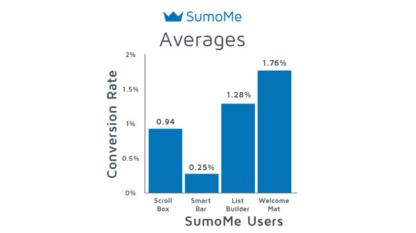
First off, according to SumoMe, here are the conversion averages for the various tools that they offer.
Editor’s Note: If you are not currently gathering emails for your site, sign up for SumoMe right now because their tools are free and easy to use
Anyway for all of you who are unfamiliar with SumoMe, they offer a set of free tools that help you build your email list. And their most popular tools are the scroll box, list builder, smart bar and welcome mat.
The scroll box is an email form that slides in from the edge of your screen once you’ve scrolled down a set distance on a post. The list builder tool is essentially a popup form.
The smart bar is a sticky form that stays atop of every single page. And the welcome mat is a full page signup form that occupies the entire screen and forces you to pay attention.
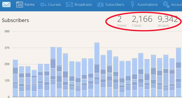
Right now, my blog averages over 300 email signups per day based on a collection of different forms on my site. Let’s see how my numbers compare to SumoMe’s averages.
Get My Free Mini Course On How To Start A Successful Ecommerce Store
If you are interested in starting an ecommerce business, I put together a comprehensive package of resources that will help you launch your own online store from complete scratch. Be sure to grab it before you leave!
Table of Contents
How My Popup Form Performs
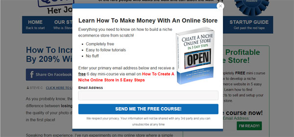
Right now, my popup form is designed to display 20 seconds after a user has entered the page. How did I choose this number? A while back, I played around with different values and discovered that 20 seconds performed the best for my blog.
Some people advocate displaying your popup immediately whereas some people swear by 30 seconds or showing the popup only upon exit. But for MyWifeQuitHerJob.com, 20 seconds is what works. Make sure you do your own testing.
Currently my popup converts at roughly 1.6% which is 25% better than the “average” SumoMe list builder performance.
But here’s the thing.
According to SumoMe, the top 10% of users convert at 7% for their popups which is a number that I find almost too good to be true.
Editor’s Note: If anyone out there is getting a 7% conversion rate on their popup form, please teach me the secret:)
In my mind, the only way to achieve those numbers would be to do the following…
- Offer a very specific giveaway based on the content of every post
- Drive extremely targeted traffic to specific landing pages that contain the popup
- Display a different targeted offer to visitors who are already signed up to the newsletter
Bullet #1 above would take a tremendous amount of work on my part that I’m not willing to invest in at the moment.
Bullet #2 is hard to control since I get random traffic from all over the place.
And bullet #3 is easily doable with an email marketing provider like ConvertKit but it’s not high on my priority list..
Overall based on the status quo, I consider a 1.6% conversion rate respectable for my popup.
How My Scroll Box Performs
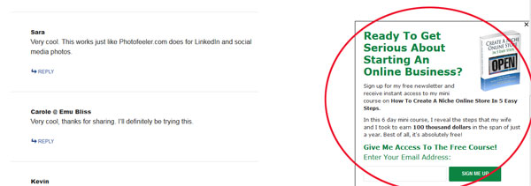
Out of all of the signup forms on my site, my scroll box performs the WORST out of all the forms at only .1%. In fact, it is so low that I’ve contemplated removing it from my site altogether.
According to SumoMe, I should be getting at least .94% but there’s an obvious explanation why mine performs so poorly.
First off, my scroll box only appears once the user has scrolled down below the comments on the post. The majority of readers never make it down this far.
Note: If your scroll box is performing poorly, then you might want to make it appear higher up in your content.
Second of all, if you scroll down below the fold on any of my posts, you’ll notice that a fixed sidebar slowly fades into view. And within that sidebar is a signup form that converts at just a hair under .6%.
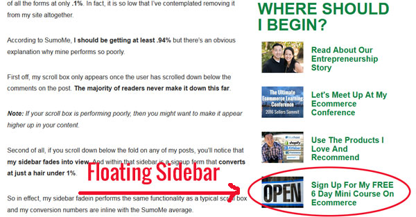
Unfortunately, even if you combine my sidebar fade-in along with my scroll triggered box, my site still performs worse than the SumoMe average. And the reason is probably because I have too many options in my sidebar.
If I want to improve email conversions at this location, I probably need to remove everything on the sidebar EXCEPT for the signup form.
How My Byline Form Performs
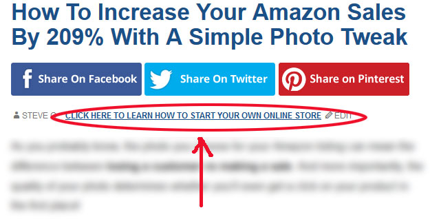
Instead of using the SumoMe smart bar at the top of every page, I’ve chosen to include a signup form in the byline of every post. Why?
Most people who arrive at your website are there to consume your content. And the majority of people never even look at the top of the page.
So it stands to reason that a small signup form at the top of your content will convert better than a form at the top of your page.
Right now, my tiny little byline signup form converts at almost half a percent. Should I include a smart bar in addition to my byline signup? Probably, and I’m considering adding it right now.
How My Static Sidebar Form Performs

Most people discount the power of the static sidebar web form. And if you were to believe the email marketing gurus out there, you would probably think that it’s not even worth using.
But what if I told you that it’s my second highest performing form on my entire site?
Currently, my sidebar form converts at 1.4% which is just a shade lower than my popup form. Not bad right?
But you can’t just slap on a random signup form in your sidebar and achieve these results. You have to make the form stand out.
Here are 2 things that I did to boost conversions for this form.
- I added a picture of a book next to the form. Including a picture of a tangible object will boost conversions
- I added a dark green border around the form. Including the border makes the form pop out of the page.
Don’t neglect the sidebar form!
How My Bottom Of Post Form Performs
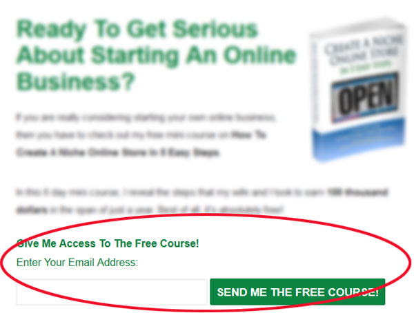
My third highest converting form is a very simple one that I’ve included at the bottom of every post. Remember, most visitors are blind to everything outside of the content so you should embed as many signup forms within your content as possible!
But if you’re too lazy to do that (like I am), you should at least include a signup offer at the end of every post.
But you can’t just shove a random form in there. Make sure it blends in with the content!
Note: This strategy is known as the Turner Technique named after Brandon Turner of Bigger Pockets
By making your email signup form look like a part of the post, you can achieve incredible conversion rates outside of your standard popups and slide-ins.
Right now, my bottom of post form converts at 1.3%.
How My Front Page Banner Performs

One of the highest converting forms that SumoMe offers is the “welcome mat” which is basically a full page signup form that prevents you from reading the content before it’s closed.
While I’m sure that it converts pretty well, right now I’ve decided against using it because I think it would annoy my readers.
As a result, I’m only including a “poor mans welcome mat” on the front page of my blog. In fact, I wouldn’t even call it a welcome mat. It’s more like a gigantic signup form on the front page.
If email conversions were my 1 and only goal, I would remove all navigation on the page to eliminate distractions.
But I know that many of my readers use my front page to navigate to the other parts of my site. As a result, I chose to use a single large banner form which converts at about 7%.
These numbers seem to fall inline with the top 10% of welcome mat users with the exception that it’s only shown on the front page of my site.
I’m still on the fence as to whether I should use the “welcome mat” approach on every page of my site. I’m torn!
Miscellaneous Forms
There are 2 other forms worth mentioning on my site.
On my “Our Story” page, I have a signup form embedded within the content that converts at roughly 4%. Also on my “Start Here” page, I have a signup form that performs at 6%.
Both of these pages attract reasonably large amounts of traffic so it made sense to embed a custom form.
In fact, I’ve gone back and rewritten all of my high traffic posts to include multiple signup forms.
If there’s a key takeaway here, you should go through your Google Analytics and find out your highest performing articles and embed forms within the content.
Once I started doing this, my email signups increased dramatically.
Click here to see a post example of what I’m talking about.
Conclusion
When it comes to increasing the number of email signups on your site, you have to make an active effort. And the more “custom” features you can add, the better.
At the very least, you should install SumoMe and add a scroll bar, popup and smart bar. It’s free and a no brainer.
At the very least, you should include a sidebar signup form and a “blended” form at the end of every post.
But in order to get the most bang for your buck, you need to start asking for signups within your content on your highest traffic pages. Seriously, if you haven’t looked at your analytics in a while, go find out where the traffic is coming from.
Then, rewrite these posts to seamlessly ask for an email.
Good luck!