A while back, I posted the results of my most recent website redesign. And while I managed to increase the desktop conversion rate by over 42%, the gains for mobile and tablet were much more modest.
At the time of the redesign, my tablet conversion rate was up 25% year over year and my mobile conversion rate was up 21%.
Even though I was happy with these gains, switching to Paypal One Touch made them even better!
Editor’s Note: Click here if you want to get the nitty gritty details about my website redesign and exactly what I did to boost conversion rates.
Get My Free Mini Course On How To Start A Successful Ecommerce Store
If you are interested in starting an ecommerce business, I put together a comprehensive package of resources that will help you launch your own online store from complete scratch. Be sure to grab it before you leave!
My Results From Switching To Paypal One Touch
Before I go into the details of the simple change I made, here are the results of my little tweak.
Note: The following conversion results are for Google CPC traffic only for the last month. A full split test was not conducted in the interests of time but my mobile conversion rates have held very steady for the past 2 months prior to this experiment.
- Desktop conversion rates remained steady
- Mobile conversion rates increased by an additional 24.7%
- Tablet conversion rates increased by an additional 30.8%
Pretty amazing results right?
But I’ll be honest with you. I’m actually a little embarrassed that I didn’t make this change a long time ago.
And the biggest difference is that I have a lot more time to work on my online store now that I finally quit my job🙂
Anyway, enough small talk. Let’s jump to the details.
The Main Hurdle To Selling On Mobile Or Tablet
When it comes to making sales on mobile, here are the main reasons why people never complete the checkout process on mobile.
- Checkout Process Too Long – The forms are too long or overwhelming
- Too Much Data Entry – Typing on a mobile phone is painful
- Payment Method Not Available – Not everyone wants to pay by credit card
- Payment Process Not Clear – A distracting and overwhelming design will cause people not to finish checkout
- Website Too Slow – Your site starts shedding visitors after 4 seconds of load time
- Site Doesn’t Appear Secure – You need to reassure customers that your checkout is secure
During my redesign, I thoroughly addressed all of the points above except for the second one.
And for me personally, the biggest hurdle to checking out on my phone is having to enter my contact and credit card information using a tiny keyboard.
The Main Problem With My Site
Now a well known solution to the “data entry” problem is to use a third party processor like Paypal Express or Amazon Payments.
Because these services have all of your customer’s information on file, you can easily import their billing and shipping information so that they don’t have to enter it all over again on your site.
In addition, using these services eliminates the need to dig up your credit card to type in 16 numbers which is a major pain in the butt.
Now that being said, I’ve had Paypal on my site since 2007 but what was I doing wrong?
And more importantly, are you making this mistake on your website as well?
A Poor Paypal Implementation
I’m going to illustrate this mistake with an experience I had just the other day ordering a teleprompter remote from a popular camera equipment site.
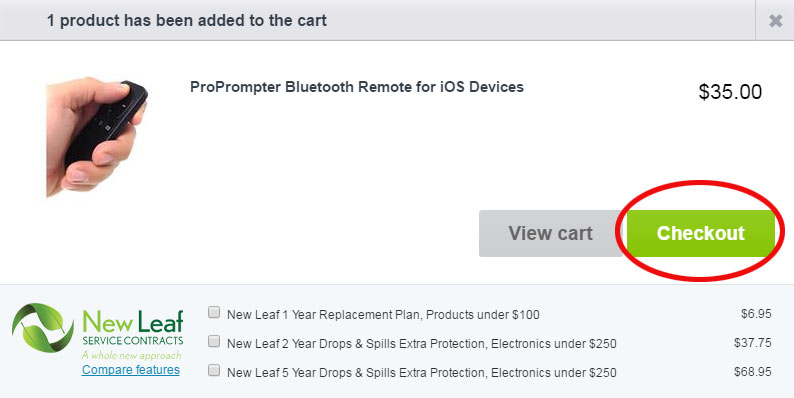
First off, I added the item to my cart as shown below.
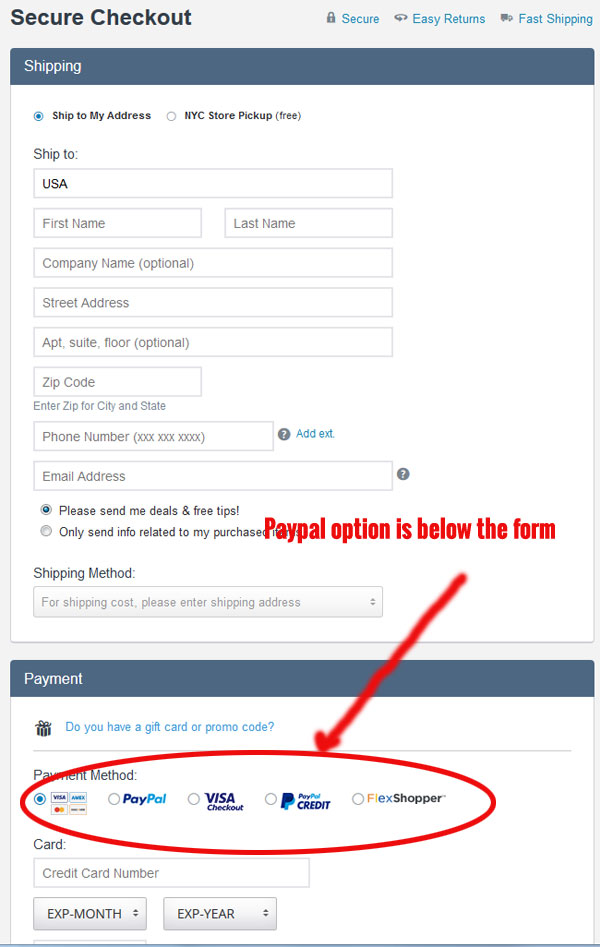
Then, I clicked on the big green “Checkout” button and here’s where I landed.
Now even though I knew that I wanted to pay by Paypal, the layout of their form forced me to type in all of my address information first when Paypal could have populated everything for me.
In other words, if they asked me to login through Paypal first, I could have saved myself a ton of typing.
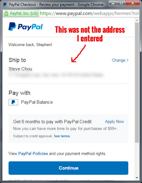
Instead what happened was after I typed my contact and address info, I was whisked away to Paypal’s site where I had to select my address information a second time.
The upshot is that even though Paypal could have saved me a lot of typing, this online vendor made me fill out a long, unnecessary form.
If I was checking out on my phone, I probably would have left.
Another Confusing Implementation Of Paypal
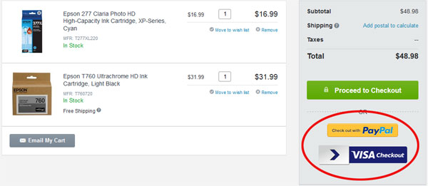
Now a better way to implement Paypal in your checkout flow would be to show the Paypal button much earlier in the checkout process. So your first instinct might be to offer multiple payment buttons on your shopping cart page as shown below.
Now this solution is better than the last one but it’s still pretty confusing. And to put things to the test, I asked my Mom to buy an item on this site and pay by Paypal.
And guess what?
She clicked on the big green “Proceed To Checkout” button instead of any of the other options below it. After all, she wanted to checkout and those other 2 buttons looked like banners to her.
My Paypal One Touch Implementation
Taking all of these factors into consideration, I decided to make Paypal much more prominent in my checkout flow and also explain the implications of each option.
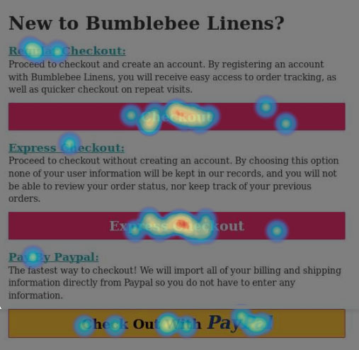
Here’s what the first step of checkout looks like for me now.
You’ll notice a few things.
First of all, I have explanations for each option.
By choosing the “Paypal” option, we will import all of your billing and shipping information directly so you do not have to enter anything in.
This made things much more clear for shoppers like my Mom.
After this one simple change, not only did the conversion rate skyrocket but my Paypal usage almost doubled.
In fact, the percentage of Paypal users rose from 13% to a little over 23%!
Further Experiments
With a lot more of my mobile customers using Paypal, it might make sense going forward to have Paypal at the top of my checkout options.
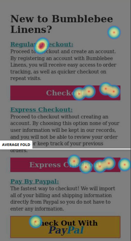
For example if you look at the heatmap below, you’ll notice that my Paypal checkout button is below the fold on mobile phones.
Who knows how many of my customers aren’t seeing the Paypal button because they aren’t scrolling down?
So I’m now experimenting with a higher Paypal button placement.
Conclusion
The key to boosting your mobile conversion rates is to make your customers enter in as little information as possible.
And the best way to do that for brand new shoppers is to offer a payment option where their information is already stored such as Paypal or Amazon payments.
But just adding a button isn’t always enough. You have to educate your customers about the various checkout options and present them in the correct order.
Don’t make them fill out an unnecessary form because the fastest way to drive a mobile customer away is to make them type.
In any case, the next logical experiment here is to offer Amazon payments to see what happens. In the back of my mind though, I don’t want to offer too many different payment options either because that tends to confuse customers as well.
Stay tuned.

Ready To Get Serious About Starting An Online Business?
If you are really considering starting your own online business, then you have to check out my free mini course on How To Create A Niche Online Store In 5 Easy Steps.
In this 6 day mini course, I reveal the steps that my wife and I took to earn 100 thousand dollars in the span of just a year. Best of all, it's free and you'll receive weekly ecommerce tips and strategies!
Related Posts In Conversion Optimization
- Improving Mobile Checkout – Why You Should Turn Off IPhone AutoCorrect
- Do You Need A 1800 Toll Free Number For Your Online Business?
- Poorly Designed Websites: 9 Mistakes Ecommerce Store Owners Make (And How To Fix Them)
- The Best Online Shopping Websites Use These 9 Pages To Improve Customer Trust And Bounce Rate
- Web Design And Development – 7 Tweaks That Drastically Increased Our Online Store Sales

Steve Chou is a highly recognized influencer in the ecommerce space and has taught thousands of students how to effectively sell physical products online over at ProfitableOnlineStore.com.
His blog, MyWifeQuitHerJob.com, has been featured in Forbes, Inc, The New York Times, Entrepreneur and MSNBC.
He's also a contributing author for BigCommerce, Klaviyo, ManyChat, Printful, Privy, CXL, Ecommerce Fuel, GlockApps, Privy, Social Media Examiner, Web Designer Depot, Sumo and other leading business publications.
In addition, he runs a popular ecommerce podcast, My Wife Quit Her Job, which is a top 25 marketing show on all of Apple Podcasts.
To stay up to date with all of the latest ecommerce trends, Steve runs a 7 figure ecommerce store, BumblebeeLinens.com, with his wife and puts on an annual ecommerce conference called The Sellers Summit.
Steve carries both a bachelors and a masters degree in electrical engineering from Stanford University. Despite majoring in electrical engineering, he spent a good portion of his graduate education studying entrepreneurship and the mechanics of running small businesses.





Great article, shows you just how important testing and analyzing data is.
Are you using Getclicky for your heat maps?
I use HotJar
Great points. Question is, is it easy to change these settings on my own? I have WordPress and woo commerce. Where can I change these settings? Would love to know.
Hi Rachel,
These changes are all cosmetic so it’s just HTML