Podcast: Download (Duration: 55:33 — 76.6MB)
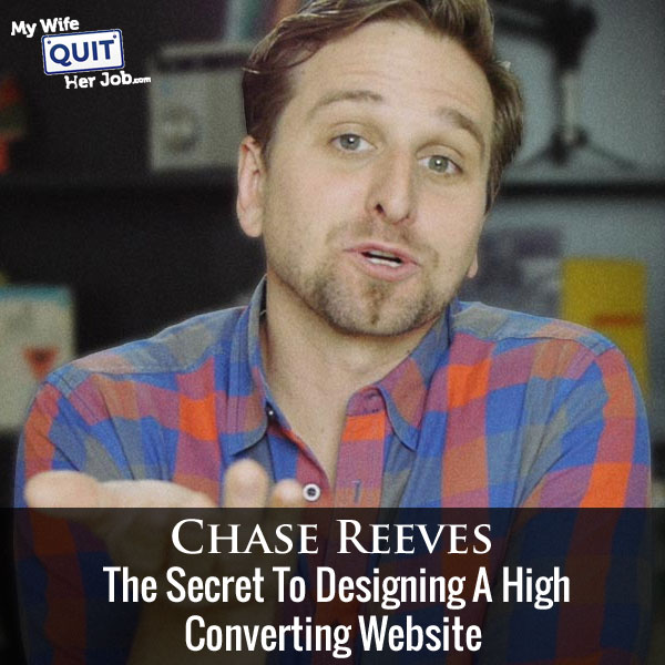
Today I’m thrilled to have Chase Reeves on the show. Chase is someone who I met recently at the FinCon Expo in Charlotte and the face to face meeting was a long time coming.
If you don’t know Chase, he is the creative director for Fizzle.co, Corbett Barr’s awesome online business training course which was mentioned back in episode 45.
And he’s also the goofy white guy on the Fizzle podcast where he’s frickin hilarious. You should check it out. But the main reason, I decided to have Chase on today is because is he is great at design.
Here’s the thing. He’s not a developer in the traditional sense, but he’s just really good at designing websites that clearly convey a site’s true purpose and value proposition. He’s designed countless websites for entrepreneurs like Corbett Barr and Pat Flynn and I’m really excited to have him on the show to talk about how he does it.
Get My Free Mini Course On How To Start A Successful Ecommerce Store
If you are interested in starting an ecommerce business, I put together a comprehensive package of resources that will help you launch your own online store from complete scratch. Be sure to grab it before you leave!
What You’ll Learn
- When you should redesign your website
- The main things to consider for your design if you have an ecommerce store
- The pain points that Chase tries to address in every site design.
- Chase’s target design metrics
- Design guidelines that your site must follow to increase conversions.
Other Resources And Books
Sponsors
Bench.co – If you hate bookkeeping and accounting as much as I do, then why not use a service and contract everything out? Not only is Bench Accounting easy and affordable but you can click here and get 20% off your first 6 months of worry free bookkeeping.
Transcript
Now before we begin I just want to give a quick shout out to famebit.com for being a sponsor of the show. Famebit is the number one market place for influencer marketing with over 20,000 Youtubers, Instagramers people on Twitter and Vine looking to promote your company in any vertical whether it be beauty, tech, gaming, pets and more. Yes you can get famous Youtubers and Instagramers to promote your business for as low as $50.
The best part is that you don’t really need any money at all to post a campaign and receive free proposals from creators. Now if you’ve listened to my podcast before, one of my guest Emanuel Eleyae used famebit.com to make over $65,000 in four months with YouTube influencer marketing. And the best part is if you use coupon code mywife@famebit.com you will automatically get $25 off your first campaign. So go to famebit.com right now, and get famous youtubers to promote your products, now onto the show.
Welcome to the My Wife Quit Her Job Podcast. We will teach you how to create a business that suits your lifestyle, so you can spend more time with your family and focus on doing the things that you love. Here is your host, Steve Chou.
Steve: Welcome to the My Wife Quit Her Job Podcast. Today I’m happy to have Chase Reeves on the show. Now Chase is someone who I met recently at FinCon I think in Charlotte, and the face to face meeting was a long time coming to be quite rank. If you don’t know Chase he is the creative director for fizzle.co, which is Corbett Bar’s awesome online business training course, which was mentioned back in episode 45 when I had Corbett on the show.
And Chase is also the goofy white guy on the fizzle podcast where he is freaking hilarious, and you should definitely check out that podcast. The main reason that I decided to have chase on the show today is because he is great at design. So here is the thing, he is not a developer in the traditional sense, but he is just really good at designing websites that clearly convey a site’s true purpose and value preposition.
And he’s designed countless websites for famous entrepreneurs like Corbett Barr, Pat Flynn, he did nerdfitenss.com. I’m really excited to have him on the show to kind of talk about how he does it in the process, so with that welcome to the show Chase, how are you doing today man?
Chase: I’m doing good Steve; really pumped to be here, thanks for having me, you are right in that meeting each other at FinCon was long overdue.
Steve: Have you gone to previous FinCons before?
Chase: That was my first FinCon and I was impressed, I liked it. I really liked PT Money, the guy who puts on the show, I met him at WDS a few years back, and he just seemed like just as a cool dude. So his event lived up to my expectations.
Steve: Cool man so maybe I’ll see you there next year?
Chase: I think so.
Steve: So give us a quick overview about how you started out designing websites and kind of how you ended up at Fizzle. And feel free to explain what Fizzle is by the way just in case people don’t remember.
Chase: Sure, yeah, so Fizzle is a membership site, I think that’s kind of crapy way of putting it. What it is, is there is a lot of people who want to figure out how to start their own business. Steve have you’ve ever met anybody who is like this before, somebody who wanted to start his or her own business or something?
Steve: I don’t know, it’s rare, it’s rare.
Chase: So what we’ve been doing for a long time is teaching people how to start their own businesses. The truth is that a lot of people love to waste time learning everything that they can, and that’s kind of a natural path is you got to go learn everything to kind of feel confident enough to get started. But the thing that we’ve learned is that the only real learning happens once you get started. So what we’ve developed is this nine stage road map, plus a bunch of other courses that are what we call just in time learning.
Everything is broken down into bite size chunks so that you can learn, how, hey, I need to grow my email list, okay, boom take this quick course on that, grow your email, and now you’ve got everything you need to know to do to grow your email list. Same thing with the road map, there is these nine stages every business goes through. So just focus on the stage that you are in right now and what’s next instead of trying to be an expert in the whole can get brutal.
So that’s what we do at fizzle, we are constantly improving that and alongside the courses and the training is the community of entrepreneurs that won’t let you quit. We just locked out really early on probably due to that I think a lot of the design and copy writing that we did on the site, and just which is always — which is of course due to who I am and who Corbett is as entrepreneurs and what we care about.
We just somehow locked out that a bunch of great people started finding us and becoming members. Now it’s one of the liveliest online business communities that you can find, and more than that it’s zero douchebagary. It’s like not douche at all, like we — the headline on our home page is honest online business training, it’s something that we’ve really built our whole business on.
It’s just this idea of like I want to build the business that’s going to last, that’s sustainable, not something that’s like a flash and a pen, get a bunch — get a million email address, just try to take advantage of old people who are wondering what to do with their money at 3 PM in the afternoon, in between televangelist spots. You know what I mean, like I’m sick of internet business being associated with that. So we kind of got started to help people find the real route to honest success, and so that’s what we teach.
Steve: So you designed that website, right?
Chase: Yeah.
Steve: How did you end up there, like what was your early web design history, before Corbett yeah?
Chase: Where that started from was I got a computer kind of younger, I wasn’t like, Corbett got like a real old computer like way back in the day like learnt out code as the first thing. I got a computer like in high school I think, and started obviously beside like playing doom on windows, playing some silly video games. I just kind of started like fiddling with like Microsoft paint and like making things — trying to make like funny stuff, I was always like, I was always the funny guy, I always like to make people laugh.
That turned into to having a computer, knowing how to use it, and then I got into music a lot, I started recording a lot of music which kept me using the computer. Then I got into college and we needed like a dorm shirt made, and I had a computer and I knew how to pirate software from the internet. So I was like, I got Photoshop now, we can make our shirt. So I did that and started like making silly things for our dorm room shirts or something.
Now this kind of kept going, band, concert, posters and things, all the things that I was associated with, that I was like, oh my band’s playing, and I knew let’s make a silly [inaudible 00:07:37] poster and so we did it. So it kind of started there and then it turned into like I got really — like my dad says, like, men are so good at computers. I just got good at computers do you know what I mean?
So like I could add a video, I could design things, I could — in Photoshop I could manipulate images, I could make music and record it, and then add it and play it back and all of these things. That honestly was the foundation on top of — that I built my whole career on. Because what happened is my taste developed and maybe that was there before hand.
Like your taste is the thing that let you go like, no, that’s not very good, I don’t feel comfortable putting that out, that’s embarrassing. That just kept getting stronger and stronger, and then my skills started getting stronger trying to like make things up to the level of taste. Soon as the long way is…
Steve: So Chase real quick, sorry so there is a difference between designing something that looks great and designing something that actually converts well too. So did you pick up those skills at a job or apprenticeship or something like that?
Chase: No, no that’s all software lessons, so for me it really came to a T when I learned how to design websites and that was — like I respect writing a lot, adds up few personal blogs and I just wanted it to look a particular way. So that’s where I started fiddling with all the stuff about 10-11 years ago I guess. So you bring up a good point, so in design it’s very common founders people start to do their own business, they really want their site to look good right? We all want that, we want it to look good.
Okay we want it to feel kind of fancy right? We want to feel quality, we want to create that — what design does is it creates trust. Right, imagine that you are learning — you are searching Google, you are going across the internet a million miles an hour, you land on billions of websites or whatever, and it’s like you — how are you going to stand out from the noise, all the old crap that’s out there?
Like design is one of — is this brutal split second trust factor thing, it’s the first step in the door all right, you don’t seem like a total piece of crap, I’ll read your headline, you know what I mean? So it’s just this sense of — it’s almost like this intangible sense really, beyond that there is a lot of functional parts of design as well. Like you are getting into it what is the difference between sort of a good looking design and a very effective design.
And what you are talking about there is the effectiveness is direct result of what your goal is on the sight. If you want your site to have a lot of people to it and they just spend a lot of time there, well then that’s one goal. Another goal is to get them on your email list. A different goal is for you to get them to buy a product.
A different goal will be to get them to not only buy one product, but then up sell them by the time you’re going to let their shopping cart right, and now they’ve bought multiple products. It’s like there’s all of these goals you can bring in to your design, it matters immensely which one you choose to design for it, does that make sense?
Steve: Yeah, totally just hey by the way Chase I’m going to just going to cut it real quick. Your mike is creating some back ground noise.
Chase: You’re getting background noise?
Steve: It’s like this scratching noise, I can’t describe it.
Chase: That’s probably online on my shirt, then what I’ll do is this.
Steve: Okay.
Chase: I can fix that, just like that. Okay. There we go how is that, is that a little better?
Steve: Yeah that’s better, okay.
Chase: Sorry about that.
Steve: Yeah no problem okay so hey…
Chase: I’m saying I like this thing and walk around so I’m kind of like I’m mobile.
Steve: I still here the scratching noise actually.
Chase: Okay you still can hear it now; you can still hear it now. Can you hear it now, am I still making…?
Steve: Yeah you’re good now, yeah maybe it’s only when you move.
Chase: Okay I’ll try to stay still.
Steve: Okay, all right so Chase one fundamental question that I always think to myself is when does a website actually need a redesign, and when are things just okay as is?
Chase: It depends, obviously it comes back to that idea about your goal right, so if your goal is to sell more products, up sell more products across your site, I’m speaking specifically to in ecommerce terms here so that because I understand most audience is doing ecommerce stores, is that correct?
Steve: That’s correct yeah.
Chase: Say you wanted to start up selling more things, well that could be a design goal, that could be a business goal that design helps you do, right? Other times you might just feel like way out of step with the competition, you might just feel like dude I look like it’s 1992 and everywhere else is playing in 2015. I really need to update my brand.
Steve: Okay.
Chase: Another time might be when your business has changed direction, kind of changed focus, and you’re like actually this doesn’t feel like, I’m still using last year’s strategy in my design when I have a new strategy that I really want people to understand and resonate with, right?
Steve: Right.
Chase: Those are all perfect examples of when you might want to redesign something.
Steve: When someone comes to you with like a Pat Flynn or a Collin and says hey I need my site redesigned. There’s probably some sort of process that you go through right to figure out what their goals are and where you even start, because everyone’s different right?
Chase: Yeah.
Steve: How do you proceed?
Chase: Yeah absolutely, so perfect example is when Pat Flynn of Smart Passive Income needed to have a site looked at. Actually what happened was a long time ago I emailed Pat and I just thought the design, I’d probably, I had kind of gotten to know him a little bit. I was just like dude your site looks really lame, this is back in the day. He was under the impression that it was really the coolest site; he’s said what do you mean? Everybody loves my site, it’s working really well, what are you talking about?
I’m like listen here, I’m just saying, I took some screen shots like this is gross, that’s gross, all of this is out of line. You don’t have any great typography, like it all just feels a little sort of 1992 to me. He was like okay I guess whatever, and then like a year later he finally got in touch with me and was like, dude I really want you to design my site, come on let’s talk about it.
What happened is Corbett and I flew down to San Diego and we did a weekend down there just doing all these preliminary things and actually packaged this all together in a course within Fizzle called “The essentials of design for none designers,” okay.
Steve: Okay.
Chase: It’s just for business builders, for people who aren’t designers and there’s kind of like, in making the course I really sliced and diced my process into a few different things and then I call it craft C-R-A-F-T. Okay, so the C stands for a clarity of purpose, all right it takes a lot, this is that goal that we were talking about previously. What’s your goal and it’s not just what’s your goal, it’s what’s your goal right now, because your goal is going to change.
Your goal might eventually be to be at the level where Pat Flynn is or what Steve Chou is or who knows where right, but right now what’s your goal, what’s your goal right now. I’m trying to get to X amount per month or this year is the year that I something, something, something. That’s why it’s important not to go like I’m going to be Dave Ramsey, yeah okay.
I mean you can have a sight that looks like Dave Ramsey’s, it doesn’t mean that your business is performing like Dave Ramsey’s business right? The idea is where are you going right now, what’s your purpose right now and that always comes from who are the people I’m trying to attract, and what are they looking for that I can help them with right, it’s always comes…
Steve: These are like more broad based goals as opposed to specific ones like build an email list for example?
Chase: Totally.
Steve: Okay yeah.
Chase: Because that all very specific to, I mean to build an email list might not be relevant in 5 years, it might not be at all, but having a clarity of purpose, knowing what people in your audience rally want. Knowing the kind of wants you want to attract to your website, that is always necessary, that is always essentials right, and that’s where everything starts, so that’s you have this clarity of purpose that’s the C, then the R is a ruthless…
Steve: Can we focus on the C a little bit more; I know you’ve got 5 letters to go.
Chase: Yeah no, I mean…
Steve: But so for the C does that mean you have to have your target customer avatar in mind for that C potion also?
Chase: Totally.
Steve: Okay.
Chase: Now this idea of the avatar or your customer profile or whatever, I come from, I was in the web agency world for a while, advertising world for a while and that’s very prominent in a lot of different places and it’s also the world of advertising, the world of design is split on that. Especially also the world of the startups this idea of like who’s our ideal customer is very important, but a very common thing that happens is we turn these avatars, these become like not real people in our brains.
These become — and we don’t get to use the biological, like honest to God intuition that you have about someone for instance that you really know. One this is in we have a free guide at Fizzel on defining your audience, defining your ideal customer, and one of the tricks in that is this idea that who is one real person that you know who is a part, who is like an ideal customer for you.
Steve: Okay.
Chase: Then because getting to the idea of, getting to the real person, now all of a sudden you know, you could call them up and go like listen Bob, here’s what you’re struggling with, here’s what’s going on, here’s what, here’s the limiting believe. Here’s what I wish you could do right now, and here’s the product I think that’s best for you where you are right now, because it’s going to give you this result that you really want.
It’s that kind of stuff that like that when you actually have a real person verses like a paper, that’s like my, this is Sally. She is my ideal customer avatar; she sells the whole this and has to [inaudible 00:17:23]. She is really neat; do you know what I mean?
It gets unhelpful doing that, because now you’re like I guess Sally would like this, I don’t know, Sally is not real. Whereas you know Bob in real life, and you’re like actually I would feel cheesy to Bob, actually Bob wouldn’t be able to find that. This is helping you make actual real life decisions about your conversion and design and copywriting on your site.
Steve: These people does it matter how many of these people there are out there, or do you just focus on one real life situation first?
Chase: That’s a great question, and you go with your gut. My experience I’ve been doing this for a while I would say I pick like one, it just happens naturally that’s seasonally, I pick one, one at a time, and then that might change in three months or two weeks or 6 years or whatever, but I’m checking in on myself. Okay we’re still making this for Joe, is that what this is still for, or is she already moved passed that and now we should go back to someone else, do you know what I mean?
Steve: Okay.
Chase: So having that real person that you can actually talk to, super, super valuable.
Steve: Okay, got it okay.
Chase: Does that make sense on the clarity of purpose?
Steve: It does yeah, let’s move on to R.
Chase: Okay so with R again this all still all stealing a craft because I’m a crafty little minx, R stands for this ruthless focus, all right, so…
Steve: R stands for ruthless?
Chase: Ruthless man.
Steve: Ruthless okay.
Chase: Ruthless focus. There’s a famous quote about writing, it says that in writing you have to cut out your darlings, you kind of have to murder your children. These little bits in your article that you really love, but they just don’t support the point of the article. You know what I mean, you have to cut those out because in order for the article to make more sense to more people.
Same thing with your website, the more crap you have in your website, the harder it is for someone to understand what the hell they’re supposed to do there, right. You don’t want to treat your website like some vest ad, like a TGI Friday, one of the waiters there that has got the flare all over the place and they’re leaning down at the table. They’re like hey guys really excited that you’re here are at TGI Friday. Can I tell you about our Apple Zilla, smash? We’ve got a great news or something or rather.
That’s not what your website is, your website isn’t this big convoluted messy bunch of buttons and Instagram feeds, and all of that sort of stuff. It’s focused, why? Because you have a clarity of purpose, you know who’s out there, what they’re struggling with, how your product solves their problem, and now you have to edit. You have to remove things so that that’s what they understand about it. It’s not just knowing what your purpose is, it’s effectively communicating, and that means you don’t say other crap on your website. Does that make sense?
Steve: Yeah, so one thing I teach in my class, is for example if you are on ecommerce store on a product page, the whole purpose of them going on that product page is to hit the “add the cart” button. Is that something similar to what you are saying?
Chase: Exactly, exactly. That actually gets to the next one which is A, which is you get to choose one action per page, one action per page and yeah, for that product page. For example, guess what the action is, you nailed it. It’s click the button, add to cart. It’s not – and actually in some ways the insight there is not that it’s just that, it’s how do I get them to — how do I get that experience to feel like they are more prone to complete the cart.
Because anybody in ecommerce knows that like cart abandonment is a really big deal, because people are adding things to carts, because it’s easy to do so. It’s just this virtual little click. It doesn’t cost me anything. But then, “No, maybe I want it. No maybe I will come back here later.” And they never do.
I don’t know how — there’s ways and designs that you could sort of make that feel a little more substantial, they click it, the cart goes from 0 to 1 and gets bigger, and you have a message that goes, “Awesome. Just think of what it’s going to feel like when you get your good new gismo, and you put it on your thingy, and everything is amazing, and your life all of a sudden has meaning and purpose.” Whatever it is that you have to try to tell them or something, but the action idea is that there’s one action per page.
I would — most of the people, a lot of the people that we help coach are bloggers and podcasters. I kind of have this idea that I’ve always stuck to about there’s basically one action across your entire website, because you can treat things progressively over time. You can be in a relationship with your customers over time if you pick the first right action. If your first action is just “purchase,” ecommerce is a little different than blogging, because in blogging world, you kind of want your first action right after them reading something or acting on something and like it, you want it to be like getting on the email list.
Now you can have a second action. Yeah, maybe follow on social networks somewhere, but like we all know that’s not nearly as effective as email. If you everywhere across the site you are getting people on your email, now you can justify a second point of contact hopefully, if you don’t just go straight to …
Steve: Does that imply that you remove all the other buttons except for …
Chase: Go on. Keep on.
Steve: Except for an email sign up when you can. I actually haven’t looked that closely at the Fizzle blog, but do you not have social media buttons or anything.
Chase: We really don’t have social media buttons or anything. We make those a part of the first email that goes out to people. Basically the big action across the site is, we are kind of split right now, because we’ve also got a lot of people coming to the site for the second, third, fifth, tenth, a millionth time.
We have like a 150,000 uniques on the site every month. There’s many different customer segments there that we kind of have to serve. This is what happens when you site gets bigger, bigger, and bigger. When it’s smaller, when you have a more pointed niche kind of focus, a lot of the sites I design, have been like that.
When I designed Pat’s site, when I designed Nerd Fitness for example, Steve Kamb’s website, the conversation went up by 80%. When we redesigned, traffic conversion went up by, it was either — it double, went up by 100%. When I designed Small Passive Income, which was a bit bigger than think Traffic, actually not Demo Traffic and conversion stayed relatively similar, but one of Pat’s goals was to get a lot of people over to the podcast page.
I had — his podcast listeners went down because a lot of people were listening wherever in the blog before. I had changed how some of that works for the sake of being way more focused and focusing on one action. And what happened is he realized how much of a goal was for him to keep his podcasts listeners up. We had to go back and make some changes. Design is that iterative thing like that.
When you have big sites, you kind of have to do the work to identify those different user groups to be able to serve all of them. But as you are saying, for the most part, you got, if you pick one action across the site, it’s going to perform well on that action. You will have to do some testing over time, see how it’s doing. Maybe that’s the wrong action, who knows. That’s where you get to use like sort of like your intuition on this stuff, right?
Steve: Yeah. I’m just thinking about all these blogs that I look at and a lot of them have these really cluttered side bars and a whole bunch of buttons everywhere, social media buttons. Somewhere buried in there they have the email sign up form. I was just curious maybe we can talk about some examples later on once we get through your framework.
Chase: Yeah, definitely. That’s C claritive purpose, R is the ruthless focus, A is the only one action per page, and F is for your first time visitor. This is, you want to design your site for growth. Maybe in an ecommerce situation you are designing your site for impulse buyers in somewhat, which in the same way, that’s a first time visitor. But when you design it for your first time visitor, instead of for your over and over and over again visitors which always is going to happen. They are going to find tier way around over time if you keep putting up great content, if you have new products etcetera.
But this first time visitor, what I find is that if you can do the work to sort of slip into their skin, and think about what it feels like to land on your site just another ecommerce site that they are landing on. Because they don’t give a crap, they don’t care who you are. They don’t care about the product, they don’t care who you are. They are busy. Their mum is sick. Their kids are yelling in the background, who knows where they are.
They seriously don’t care about you or your website designer or anything like that. What are they interested in? What do they want? What do they want that brought them to your page? What’s their intention? Then, how can your site perfectly line up with that intention?
Steve: How do you figure out that sometimes? Do you use any tools to figure that if you don’t really know?
Chase: Honestly my favorite tool for this is customer interviews.
Steve: Interesting. Okay.
Chase: For developing more content businesses, customer interviews are great. You can obviously use search stuff, looking through Google’s key word, tracker thing. You can look through Moses tools to understand how people – with obviously Google analytics looking where are people searching that they are landing on this product page. How can you infer like the intention from that thing.
But for me, I’m often times, I find and a lot of people find this. You can be really intuitive about that and sometimes you hit the nail on the head. But often times you think it’s this reason, but really it was totally different, it’s this reason over here that’s why. And if you knew that before hand, you could totally have — you would totally change the design or the copywriting on this page.
One great example of that is, there’s a framework called jobs to be done. This milkshake stand every morning filled up with people. What the heck is this all about? They hire –meaning people just do like pack, get buying milkshakes like crazy in the morning. It doesn’t seem like a very morning kind of thing for me to do. That seems strange.
They hired these business consultants to check out what’s going on here. They started talking to customers and realized everybody that was there was a commuter. They were driving a long a distance to work. They needed to get breakfast, but something that they could hold on one hand while they are driving. And they needed it to kind of keep them filled up at least till lunch time.
The milkshake weirdly fulfills all these rules, but there was no merchandise or marketing of billboards out saying like, “Have a milkshake for breakfast.” It’s just something that a lot of people started figuring out on their own. That changed the idea of how you can present what’s available to the people during the morning time at the milkshake stand. It’s one of those weird, like you could have been intuitive about this, now that we are going backwards. But it took talking to customers to really understand where it came from.
Now I understand talking to customers actually is kind of a nightmare for most of us entrepreneurs. Honestly, it still is for me. I’ve done a lot now so I sometimes get a little excited about it, but most of the times, it still feels like work. In an ecommerce business, it can feel really kind of weird.
Steve: It’s actually not so bad. So earlier on, whenever a customer actually called us, I would interrogate them so to speak. I did a lot of that earlier on. I don’t do it anymore obviously, but it was quite helpful. We found a lot of bugs with our site that way.
Chase: Yeah, it makes tones of sense because when you get to — the whole point of conversion and design, the whole point of this craft frame that they develop is how do I get you out of your skin and into an actual potential buyer skin, not only just a potential buyer but like that ideal customer?
How do I let you know what it’s like for Bob to land on your website after they’ve been on hundreds of similar websites? How can you really grab Bob’s attention and resonate with them by saying, “Bob, I know who you are. I understand what you care about and this is the thing.”
A great example of this is like, comic t-shirts or Giki culture of some kind. The kind of place that has that t-shirt and that highly curates hilarious comic books inside joke type t-shirts or knickknack and things like that, all of a sudden I feel like these people know who I am, because they are getting — I get these inside jokes from world of Warcraft or Minecraft or something like that.
It’s that kind of like “You are speaking my language. Holy crap, I found — these people know who I am.” That’s where I always loved those smaller sort of niche sites even though you might have less people to your site, you might be more profitable in the end.
Steve: How about if it is aesthetics versus copy, because I’ve seen some really heinous looking websites that convert super well.
Chase: Yes, that’s a good point. This is one of the first points in the design course that I made. It’s this fancy effectiveness thing we kind of touched on the beginning. But the truth is your website’s most important assets are its words. And that doesn’t mean that just because it’s on the page it’s working, you have to tell me which words are important to pay attention to. And there are literally words I can’t unpay attention to for lack of a better term.
For instance if you go to, like a site that’s very clean like Medium, if you read any articles on Medium, pay attention to how it feels to land there. There’s a big headline right centered, like in some image or something like that, and then there’s no distractions on the left or the right or even on the top. You just fall directly down into the copy and you start reading. If it’s well written, if they are talking to you, then you kind of like keep going and now they are — now they are convincing you of something. Do you know what I mean? That’s the beauty of good sales copy.
A great example to look out for that is also Base Camps home page. Unfortunately it changes all the time. But if you go to basecamp.com, you will be able to see like right now, there’s a very simple homepage; one column of text just saying here’s what we do. It’s super effective for them. To answer to your question, the words are to me the most important part. Your headline has one job and that’s to get them to read the very first sentence, which has one job to get them to read the next sentence, which has one job to get them to read the next sentence. You are drawing them in to this kind of relationship.
And so if your headline sticks out, it’s eligible, it kind of set nicely in some good fonts, it’s not gross and weird and some crazy cuss of handwriting font thing, even though you think that looks cool man. That is like neat and pretty. It’s all of these kinds of simple things. All of that details of that stuff I get into in the course. I’ll keep going on the craft process if that’s good for you.
Steve: Do you do an Asian accent too by the way? You are doing southern accent the whole time.
Chase: No I can’t listen. I mean, I think it’ll just be two item in [inaudible 00:32:46]. I can’t see. I’m not going to. How could that not be offensive? I’m trying — I do a lot on the physical shows, I do a lot of voices. I really like for instance I really like doing the Indian voice, these certain Indian voice, but I try — I’m trying to keep myself from doing anything that is not done by a Caucasian man, just for the sake of like not offending somebody.
I don’t mean any harm by it. I literally love these accents. I love the way they sound and I love making them, but I have to try and keep it to like just, I can tell you a little bit of this you know. It’s a white dude in London, is a bit of a Christ Stoker accent really. It’s not like I kind of want to go full anything else I guess.
Steve: We are on T, right?
Chase: Yeah, so F was for the first time visitor because they don’t give a damn about you. They don’t care about who you are. They have their own story in their own life going on. Either you have a product that solves their problem or you don’t. Do you know what their problem is? Can you focus on that and ruthlessly focus down on that?
Then T is the last part. It’s the testing over time. Because one of the big mistakes I see people make as they start conversion optimizing AB testing stuff, is they can actually crank down too hard on converting this time at the expense of someone trusting you to buy next time.
The idea is you want a sustainable long term business. You also — that competes sometimes with I want to make as much money as I possibly can right now. Do you know what I mean? I can slam you hard with the bill sales message, and all this crap and pop ups and things that don’t let you quit — you just try to quit the page and the job description button goes, “Are you sure you want to do this?”
You can slam people really hard with stuff which all that does now is it goes like, “Oh clearly you are desperate. I don’t trust you. You clearly don’t have a great product.” That’s becoming more and more common as more people come on to the market place savvy about computers and things.
This long term view is not looking at your business just this week or this month, but over the course of the next five and ten years, how can you keep tweaking this in a way that makes it feel more like a relationship, that makes it feel more like you are providing value for people who have an honest need, and all this everything that’s going back and forth here is totally human, it’s total like actual connection and interaction.
That’s my fantasy about business. I know it can happen that way. I’m ruthless about promoting that way of doing business instead of just like, scorch to earth policies, steal money from everyone kind of thing.
Steve: The problem with that though is it’s a little harder to quantify, right?
Chase: Yeah, it is hard to quantify. To be honest, it’s a big mistake that I see people — the first big mistake that I see people make is focusing on fanciness instead of effectiveness. Then the other side of that coin is when you focus on effectiveness too much, and have no sense of relationship in there.
There is no magic number you are trying to get to that I can tell you once you get to this kind of conversion rate, then you are a real business. It’s all has to be felt. It all has to be felt. It’s like, it’s art. It’s literally a kind of a soulful artistic way of going through the things. The truth is you could probably try to tweak a bunch of stuff on your site to increase the conversion and stuff, and you are not going to see a tone of change.
There are some places where you are going to see change and that’s going to be your headlines, that’s going to be your copywriting, stuff that’s easy for people to read, your product photos, and how enticing those kind of things look. And all of that stems from, how well do you know your buyer? How well do you honestly know your buyer? That’s going all the way back again to this clarity of purpose.
Steve: You keep mentioning conversion rate. I was just curious, you mentioned like you increased Corbett’s conversion rate, Steve Kamb’s and then Pat’s. What was the conversion metric?
Chase: Conversion metric for them was always email, so a visitor to an email subscriber. For contents like that’s the big thing because now you’ve trusted me enough to give me your email, I gave you this free book or something in return, now over time can I walk the balance of capping you with an email and making you feel like there’s some value in this, reminding you of our relationship, is it worthwhile to keep intact without you going like, “All right you are bugging me. Unsubscribe.” You know what I mean? It’s just like being at a bar and trying to woo a person of the opposite sex. It’s this delicate sort of balance. That’s the artistry and the stuff that I really love.
Steve: Yeah, it definitely it is an art. Unfortunately art is often hard to describe in words, right?
Chase: Yup. No actually it’s not. For me, I’m becoming really like — because I’ve thought a lot about that. I live more in this like sort of the fancy artist designer musician world than I do kind of in the business world most of the time even though my work is in the business world. I actually from Stephen Colbert [ph] I was learning a lot about faith and art and the things. He says things very succinctly and concretely because he’s so smart. These were in interviews not in a show or anything. Just in interviews with him out of character.
All I know for sure is that art gives you a feeling. That’s the art I’m interested in. I’m interested in the art that make me feel something. I think business is like is the thing that can make us feel something, that can remind us of our humanity, that can make us feel more connected to each other to the earth to the things, rather than just being someone who is just unconsciously consuming whatever comes in your own mouth. You know what I mean?
I want to live better. I’ve bought products that made me live better [inaudible 00:38:55] there’s a donut here in town, not voodoo donut, I live in Portland, Oregon, but this little donut called [inaudible 00:39:02] is the most delicate little [inaudible 00:39:04] bar Steve. I swear to god, it’s the donut that made me want to be a better man. I swear to god.
I believe that product, that there’s something about a great product that’s well designed, that’s thought through, that meets my needs, that kind of like, it makes me feel like, “Yeah, maybe I’m not a piece of crap. Maybe I can live well. Maybe I can stay married. Maybe I can be a good dad.” Do you know what I mean? I need all the help I can get, because that sounds really hard.
Steve: I need to get some of this donuts man. Let’s take a look at the fizzle.co website because you designed that, and obviously you were there and now, I’m just curious about some of the design elements. I notice right when you land on the page, it’s basically just a video and then the headline. It’s not even like long form copy. You got like maybe five paragraphs with the verbation and stuff free trial. I was just curious how you came up with that landing page.
Chase: We tried a few different things. We didn’t try a million things; we just tried a few of the different pages. Originally we had a long page that was really well designed, all these customer testimonials, all this part, and the other. But honestly the story of our product, of our service lives in this video. So we wanted the headline to be extremely simple and clear with a little bit of style and then you come right down into the video where in the first 15 seconds — I won’t give away the joke in the first 15 seconds, but in the first 15 seconds it was this little great like wait what!
This is, what am I watching, and them it just tumbles straight down into this little letter from Corbett our CEO. And it works really well for us because to be honest we can’t — I don’t know we could fiddle a lot with a lot more stuff, but this works really well right now.
And because it’s so simple, because it’s kind of so human and honest, because on video and the audio and the video like you hear our voices you get the reflection you kind of get know us a bit. And also in Corbett’s simple letter there, you kind of get to know our point of view just a little bit more and just the tone and things like that; it’s really effective, so it works really well for us.
Steve: Would you say that most of the people who land on that page already know who you are, or do mostly cold people land on that page?
Chase: It’s a good question. I think most — like I don’t, I couldn’t tell you for a fact one way or the other, I could probably go look it up in the analytics at some point. Or have one of my spreadsheet guys do that, we have these spreadsheets guys. Yeah, he is actually our head of growth, so he does deal with a lot of that stuff. The truth is there is going to be a lot of both, there is going to be a lot of both, I bet most that convert it’s not their first time landing on our site or the home page.
Steve: Because I’m curious for you guys, I wonder if you get a lot of podcast people come in right.
Chase: We do, we do get a lot of podcast, so we have — on the podcast we have a sort of little some tiny advertisement for Fizzle there with a special link that people go to. And that takes them to a different page that just — that gives them a special discount for people listening to the show, right?
So we do see a lot of people converting from that especially after they listen to several episodes, because what happens with people right now who are listening to you Steve, they are listening to you because they trust you. They trust your point of view, they know you have experience, and so if you recommend something to them they are going to listen to you right?
And I feel like with podcast way more than any medium, honestly even more than video, there is something trustworthy about it, because I’m listening to you while I walk the dog or I commute or I go on a jog, or I’m walking around or doing the dishes, I can listen to you anywhere. I’m rarely listening to a podcast when I’m just sitting on my butt listening to a podcast. I’m always kind of doing something else right?
So when your ear, your voice is in my head all the time, I don’t know, I feel like you get to know someone all the time through just hearing their voice kind of like when you used to have those girlfriends or boyfriends in junior high. And you were calling them on the phone and you go like, no you hang up, no you, no you hang up. I don’t know if you remember talking to people on the phone like and like your dad was like, get off the phone, I need to call someone.
Steve: I would just hang out because I was too cheeky to even talk to them so…
Chase: I just settled from x-tapes, I just…
Steve: Yeah x-tapes those were the days man, yeah.
Chase: Totally.
Steve: Okay so this page I guess then you kind funnel people through the podcast, this landing page in which case they’ve…
Chase: And the blog, I mean the blog is a different design, right? So the blog if you land on any of these posts from the blog, for instance if you give content away will anyone pay? It’s sort of one of our related episodes of the podcast where we talk all about like sort of the balance there. And you have this — where there is content, a couple of quotes, you have actual podcast player.
So this is just content, everybody is used to looking at a blog page, an article. Then there is nothing too sexy or crazy about it, I feel like if there was something crazy about it you would be like wait how am I supposed to proceed? You know what I mean, like it’s supposed to just be a blog page.
But then on the right side this is where it’s like okay we have some interesting links over here, we have a free trial sort of promotion, and then asks for the — get on the email list there at the bottom of the page as well as on the top.
Steve: Yeah it’s very minimalist, I’m looking at it right now actually, so I guess these are all the main goals that you want someone to click on. And I notice you don’t have any like previous posts, you have popular posts, but you don’t have a whole bunch of links on the sidebar.
Chase: No, I kept the sidebar super clean and minimal and just kind of like it’s like to me it’s like you get here, you land on this particular episode, if you give content away will anybody pay. If there was a longer article or shorter article, I don’t care I want you focus totally on that. If that’s interesting enough to you hopefully the call to action at the bottom or the very top will get you.
And go like, oh, well, I trust these guys, I like their voice, I’ll just go back to the blog and see what else they are talking about. Oh I can subscribe to the podcast, oh because you know what there is a lot of those little touch points, you got to see the same person at the bar maybe a couple of times before you get enough confidence to talk to him.
You know what I mean? Because very few of us are like brush enough to just dive right in, and it feels like it’s something similar in the way that a regular user person — a regular person just browses the web, finds content, and looks into stuff, you know what I mean?
Steve: So I’m looking at one of your blog post right now, and it seems like obviously that getting an email sign up is the primary purpose because those buttons are like orange right, and they stand out. So I’m just curious I didn’t notice any pop ups or anything either, and I was just wondering where your philosophy was on that?
Chase: Well I mean so to me I hate pop ups, I just hate pop ups, so I don’t do them. And I feel like I can make a big [inaudible 00:45:50] argument about how…
Steve: It’s just a philosophy thing then, right?
Chase: Disrespectful to the people, they don’t trust, to be honest they can be really, really effective tool. This is one of those situations where it’s like I have faith in humanity that I don’t have to do a pop up to get as many people on the list as possible. One of the things I just had a cruise event speaking to a bunch of podcasters, and one of the things a handful of other speakers like Chris Brogan was saying is how his favorite thing is like deleting people from his list. Like he goes through and finds everybody that hasn’t clicked any links or opened anything on his list, he sends them all an email and says, if you are not — if you want to stay on the list click this link otherwise I’m removing you. And he loves calling his list down, down, down.
Steve: I do that once a month actually.
Chase: Do you really?
Steve: Yeah I do.
Chase: What’s it like for you, do you like it?
Steve: I don’t mind it because like if they are not clicking I don’t want to be paying for those people on my list right? That’s my philosophy at least.
Chase: Yeah, I mean it’s something I haven’t done, but this is like the front end of that right? It’s almost like, if you don’t put a pop up there you are not going to get a bunch of crapy unwanted people on your list, unqualified people.
Steve: So for a blog for an ecommerce site what would you say you would — how would you populate your sidebar and that sort of thing? If making a sale was your ultimate goal?
Chase: It totally depends right, because what you have, you have the potential in some systems you have the potential for a lot of intelligence. So someone lands on your site because they were searching for rollerblades and you are selling rollerblades, and they land on this one particular rollerblade, the K2 fatty and they land there and then…
Steve: Sorry go on.
Chase: That’s a real rollerblade.
Steve: I noticed yeah.
Chase: Yeah, so then they go like, oh, this kind of interesting, but I’m not ready to buy right now and they go up to the blog. Some sites it’s very easy to have the kind of intelligence that goes like you were looking at the K2 fatty, let’s make the sidebar sort of special to someone who is looking at that. Which could be another sort of like offer for the K2 or some or who knows what right? Like wheels or any other little things, the kinds of things that you could sell.
But ultimately for a blog, this is where the difference between like I have a bunch of products for sale, and I want to create an audience for people, who believe in this kind of thing, or who care about this kind of thing right? If I was building an audience of people who care about rollerblading, I would have a kind of freebie to give away to them with like quotes from my favorite rollerblades.
Or like the top 10 rollerblade wheels or bearings revealed by someone that you know. That’s free, get on the list, will send it to you, and then you just have the responsibility to keeping that relationship good. Keeping that relationship honest and fresh too, right? So that when they do want to buy some K2 fatties they come straight to you. Because in one of the emails you are like listen, as a reader we just want to make sure that you know that we value you, the attention and being a rollerblade yadi yadi yada, here is a discount for 5% off anything in the next 30 days.
Steve: Chase this is funny yeah, I just recently wrote a post about this, I think this is the direction ecommerce is taking because you got these amazon.coms out there, where people are selling similar products, and it’s just the race to the bottom right? And the only way you can really stand out is by building a community that really appreciate you as business and they’ll buy from you just out of loyalty.
Chase: Yeah, and that to me is a massive difference, because to be honest it’s like you can sell products without a community, and you are totally in business, you are like partnered with wherever your traffic sources are which is probably going to be Google, or links from other sites, or who knows where, buying advertising, things like that. Then you do have a race at the bottom because if your prices are more than somebody else, then I’m going to go somewhere else, because guess what I could find that at the tip of my finger, like I just opened up another tab and I just search.
And frankly I’m just searching on Amazon which has the lowest prices I can find, right? So why would I buy from you? Now a good example of this a great example of an ecommerce store that the design is extremely good is Need. It’s called neededition.com, N-E-E-D edition .com, and its men’s clothing for that like sort of like 30 to 40 year old men thing. There is nothing, you don’t get discounts here, there is no discounts. But I want to buy everything on that site because he so nails who I am. Do you know what I mean?
He is like this is who you are, and he writes a little story about each of the article of clothing for sale. These funnel clothing he sells some low price items there too sometimes socks or ties or like magazines, like specialty magazines or whatever, and he nails it. And he actually he is a friend of mine, he just switched over to Shopify actually, from a totally custom built thing, now everything is running on Shopify which is pretty fascinating. Even more so then the custom thing, he is like no I would just go to Shopify after they had already spent a bunch of money making the custom thing, it’s pretty cool, that Shopify has got so many functions.
Far so much functionality rather, but that’s a great example of he is built a community and they are open rate — here is what he does, every month there is a new edition, right? So there is new articles of clothing for sale, and he’s built a massive email list, because you only get notified about the edition by email. His open rate is like 80 something percent, I don’t remember what.
Steve: That’s ridiculous.
Chase: It’s ridiculous, okay, so it’s just fascinating edition way of doing an ecommerce site. Obviously the design, what’s the design here? The design doesn’t get in the way you understand? Like the point of design is to not get in the way of what the customer wants and what the business wants. You want to facilitate that interaction as well as possible.
The message that the business has, that’s the message you are helping the audience resonate with. And the design can only amplify that or turn it down. So the whole idea is that in amplifying that, you are always going to become more minimal. You are always going to become more sort of essential, unless like flair on a vest at TGI Friday restaurant, you know what I mean? So he does that really well at Need Edition.
Steve: So people don’t comparison shop, they just buy straight from his email is what you are saying?
Chase: Yeah pretty much, so the email that comes out is just a short little bub about the spirit of this issue, of this edition basically. And then you click the link and you go over there and you see all the articles. And then I mean half the time I just read through, I have no money to spend on this stuff right now, my wife would kill me.
But I just read through it, because it’s funny, and then I really want that $130 shirt, like I really want it. Because I just read the story of the person who makes it, and the designer and the silly English guy talking about like why this shirt other than other shirts, and it’s this relationship based community based kind of thing.
Steve: And it’s not his product brands right, it’s other peoples brands, and he still…?
Chase: No, totally and now they’ve become so big that a lot of other brands have started doing collaborations with them, they’ll do a shirt that’s just for Need, which is kind of fascinating.
Steve: Awesome, yeah, I’ll definitely link up that site, it sounds really interesting.
Chase: Yeah it’s a very good example.
Steve: Cool Chase hey, we’ve been chatting for like 50 minutes man, so let’s close this with some facts about yourself. Where can people reach you if they have any design questions, do you still design websites, I imagine not anymore, right?
Chase: I don’t, no, yeah, I’m so on the — I’m full time Fizzle now. So where you can find us is at fizzle.co. And actually I went through the course on the design steps to try to just like think through what exactly to share with you guys. And I found a handful of worksheets that I’m totally good with sharing with your audience. There is one on how to visualize and do some worksheets on your first time visitor, there is also another one on like questions such as like a long term view, how do you set up your thing for a long term view, as well as another one just like the overview of this craft conversion and design system.
So what I’ll do is I’ll make those available for everyone who wants it at fizzle.co/chouchou. And I know that you said that that’s something that they might have teased you with in junior high school?
Steve: Elementary school but yeah, so it was my last name right it’s not chouchou as…
Chase: It’s your last name, yeah, so chouchou, I just wanted to have a unique URL that wasn’t too long, and I was like I just couldn’t get chouchou out of my head.
Steve: I’m sure I’ll find some way to get you back because it is my blog and I’ll be posting your graphic, so we’ll see how.
Chase: Perfect.
Steve: All right man, hey thanks for coming to the show, I learned a lot today man.
Chase: I’ll do well, thanks for having me, thanks for doing the work you do man.
Steve: Cool all right, take care.
Chase: Bye, bye.
Steve: Hope you enjoyed that episode, designing a high converting website is both an art and a science, and Chase is an expert when it comes to funneling site visitors to their desired destinations. For more information about this episode go to mywifequiteherjob.com/episode106.
Once again I want to thank Famebit for sponsoring this episode, as I mentioned earlier Famebit is the best place to YouTubers, Instagramers and other influencers to promote your products online and it works. One of my podcast guests Emanuel Eleyae used famebit.com to make over $65,000 in 4 months with YouTube influencer marketing, and it costs as low as 50 bucks to start.
The best part is if you use coupon code mywife@famebit.com you will automatically get $25 off. Go to famebit.com right now, and get famous YouTubers to promote your products and get $25 off with coupon code my wife.
Finally if you’re interested in starting your own online business, be sure to sign up for my free 6 day mini course where I show you how my wife and I managed to make over 100K in profit in our first year of business. Go to mywifequitherjob.com for more information, sign up right there on the front page, and I will send you the course right away via email. Thanks for listening.
Outro: Thanks for listening to the My Wife Quit Her Job Podcast, where we are giving the courage people need to start their own online business. For more information visit Steve’s blog at www.mywifequitherjob.com.
I Need Your Help
If you enjoyed listening to this podcast, then please support me with a review on Apple Podcasts. It's easy and takes 1 minute! Just click here to head to Apple Podcasts and leave an honest rating and review of the podcast. Every review helps!
Ready To Get Serious About Starting An Online Business?
If you are really considering starting your own online business, then you have to check out my free mini course on How To Create A Niche Online Store In 5 Easy Steps.
In this 6 day mini course, I reveal the steps that my wife and I took to earn 100 thousand dollars in the span of just a year. Best of all, it's absolutely free!





Hi Steve,
Chase mentioned that each website should achieve one goal. If a website provides two main fucntions: selling products and providing informational blog posts related to the products or niches that I focus on, do you think this website is effective? What types of pitfalls and lessons should one focus more on when building this type of website?
Thank you
Peter