
Doing a complete website redesign of my online store has been on my “to do” list for a very long time, but I could not get myself to pull the trigger because it was never a priority.
Here’s the thing. My conversion rate has always been pretty good (>3%). And my online store has been growing in the double digits every year so why rock the boat?
But then I attended a mastermind meeting 3 months ago with a bunch of other ecommerce veterans and decided to bring this up during my turn on the “hotseat”.
Hey everyone. I’m thinking about doing a site redesign, but the my current conversion rate is still pretty good. Do I need to update it right now? And do you think it’s bad enough that I need to fix it today? Can I put it off another year?
The answers I received were excruciatingly painful to hear.
- This website looks like it was designed in the 90’s. If you did a redesign, I bet you could get a 50% bump in conversion rate. – Mike Jackness
- You run a course? I wouldn’t take your class if I saw this. – Kevin Stecko
- These are the types of sites I like to buy, fix up and then resell at a profit. – Dana Jaunzemis
Hearing these comments really hurt my pride and I tried my best to not be defensive.
But as soon as I got back from the mastermind I immediately contacted my designer, whipped up a quick mockup in Photoshop, and started cranking on it.
My process for the implementation was pretty straightforward. I went through and plowed through each and every page myself, laid it out “roughly” how I wanted it to look and had my designer pick up the pieces to make it “look better”.
I budgeted about 6 weeks to get the redesign done with me contributing about 40 hours of my own time. Every single page on the site was completely redone.
Overall, the project ended up taking 7 weeks due to unforeseen circumstances with browser compatibility (I hate you IE!) and cost me $1840.
Editor’s Note: Here’s a link to my new site and you can use the wayback machine to see the old version.
Get My Free Mini Course On How To Start A Successful Ecommerce Store
If you are interested in starting an ecommerce business, I put together a comprehensive package of resources that will help you launch your own online store from complete scratch. Be sure to grab it before you leave!
Table of Contents
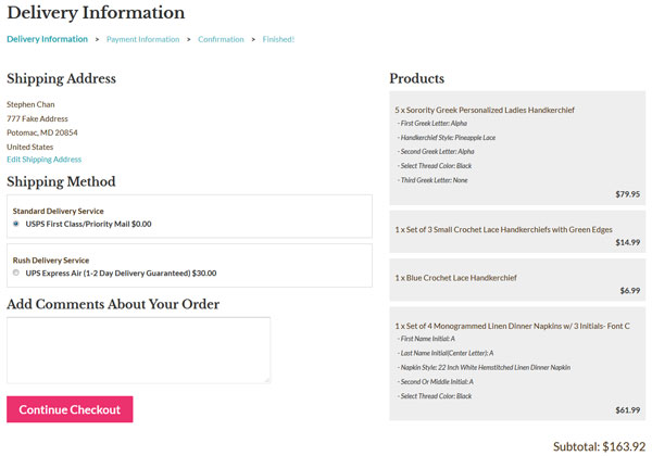
My Website Redesign Results

The following conversion results are for mobile, desktop and tablet for Google CPC traffic only.
Because my site gets a ton of traffic from content pages that do not necessarily convert to sales, running the numbers for targeted ppc ad traffic made the most sense for comparison purposes.
- Desktop conversion rates increased by 46% Updated!
- Mobile conversion rates increased by 21% Updated!
- Tablet conversion rates increased by 25% Updated!
Note: My conversion rate data was compared to the exact same period as the prior year to eliminate variables like seasonality and fluctuations in demand.
That being said, the only true way to measure conversion rate differences is to split test the designs which I did not do in the interests of time.
First off, the increase in desktop conversion rate really shocked me as I was not expecting such a large jump. I knew that my old site needed work but not this much!
(Update: After a few months of more data, the conversion rate increase for desktop is at 46%)
For tablet customers, the conversion rate increase was actually higher than 15% because I found a major bug in the tablet implementation a few weeks after launch which were mixed in with the results.
(Update: After a few months of more data, the conversion rate increase for tablet is at 25%.)
And for mobile, I had already implemented a pretty decent mobile site back in 2013 so I wasn’t expecting any huge jumps but 12% is still pretty good.
(Update: After a few months of more data, the conversion rate increase for mobile is at 21%.)
In any case despite the increase in conversion rate, not all of the data was rosy. For some reason, my onsite metrics like bounce rate have increased roughly 10% across the board.
Editor’s Note: Right now, I suspect it’s because I removed the left hand navigation from the site but I’ll need to sift through the data to find out exactly why that is happening. Update! I stopped support for several browser versions in this redesign which contributed to this issue.
What Shopping Cart Am I Using?
The most common question I always get asked with every redesign is…
Steve what shopping cart is this? Is it Shopify? Or is it Bigcommerce?
And when I tell everyone that I’m still using my heavily modified old school open source shopping cart, they are usually shocked.
Here’s the thing…
The shopping cart that you choose has nothing to do with the way your shopping cart looks, or the way your website looks. The main purpose of your shopping cart is to handle and process transactions.
If your shopping cart has all of the backend features that you need, then you don’t necessarily need to switch. The aesthetics of your website have very little to do with the shopping cart engine.
So even if you have a shopping cart that’s old like mine, as long as it has all the features you need, you shouldn’t judge it by the way it looks, because you can always change the way it looks.
The best part is that if you are on an open source platform, you can add your own features whenever you want because you have full control.
For example for this site redesign, I implemented this nifty little social proof feature for my shop. Basically every 5-15 seconds, a little window pops up in the lower left corner that displays a previous purchase made on the site.
On Shopify, you can purchase a plugin to do the exact same thing and pay $15/month. But it took me roughly 5 hours (it really should have taken 2 hours but my coding was rusty) to pump out the same thing with no recurring fees.
Anyway, these are just some of the advantages of owning the source code. If you are technically inclined, I recommend giving open source a try.
But if you are clueless about web design and you don’t want to have to deal with anything technical, then go with a Shopify or a BigCommerce.
Changing Out The Color Scheme
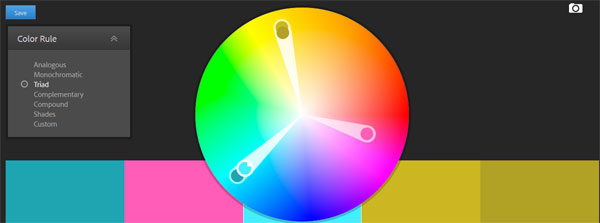
One of the biggest complaints about my site from an aesthetic perspective was the color scheme. The old site was purple and yellow and the color palette I chose made the site look old fashioned.
Editor’s Note: Here’s a link to my new site and you can use the wayback machine to see the old version.
What’s ironic is that in my Create A Profitable Online Store Course, I actually teach lessons on color theory but I didn’t have this knowledge back in 2013 so I never got a chance to put it into practice.
Anyway in a nutshell, I used a site called color.adobe.com to choose complementary colors for my new design. And to freshen up the look and feel, I chose teal, hot pink and yellow.
Why 3 colors? It’s because I wanted a specific color associated with “taking action”. I wanted a specific color to “draw attention”. And finally, I wanted a bright overall color to make the site feel “young and hip”.
Teal is my background color. Yellow is my “attention” color if I have any special offers, and hot pink is used for every single action button on the site because it stands out and pops.
Every single page on my site is designed to have a singular objective.
For the front page, I want people to browse our personalized collection because it’s the section with the highest margins. On the category pages, I want people to click on a product. And on a product page, I want people to click “Add To Cart”.
The 3 Pillars Of Conversion

One big mistake that I see people make when designing their own websites is that they try to copy Amazon.com. Amazon is the largest ecommerce platform on the planet so why wouldn’t I model my site after theirs?
First of all, Amazon’s website design is ugly, generic and not suitable for most niche online stores. The reason that Amazon can get away with an ugly website is because everybody knows who they are, they are used to the interface and they already trust Amazon.
But when you have your own website, you have to establish that trust from scratch because no one knows who you are.
Overall, there are three main things that are crucial to anyone landing on your site for the first time.
One, you need to let people know that you offer free shipping. Some sort of free shipping offer is now par for the course thanks to Amazon and the other big box ecommerce shops.
Two, because you are an unknown entity, you want to reassure customers that they can return their merchandise if they are not satisfied.
And finally, the third thing you must establish with a new customer is trust which is perhaps the most important factor of them all.
If a customer lands on your site and they don’t trust your store because they’ve never heard of you, they’re just going to pick up and leave.
For my redesign, I enforce trust in many different ways.
In the header of every single page, I emphasize free shipping, no hassle returns and my phone number. Having a phone number in plain view is VERY IMPORTANT!
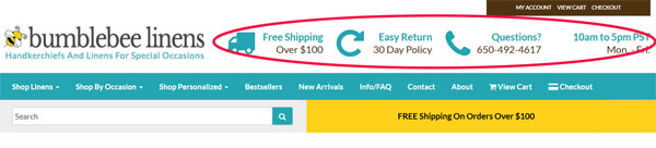
Whenever I shop online at a new boutique, the first thing I always do is click on the contact page and look for a phone number and an address. And if neither of those items are displayed or if only one of the two are present, I will not shop there.
Customers want the ability to contact a store should something go wrong with their purchase. And as a result, you want this information as visible as possible on every single page including your store hours.
Having “official store hours” also makes your shop seem more professional because you come across like an established business with “real” office hours.
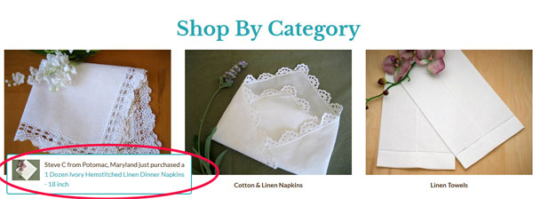
Social Proof And Trust
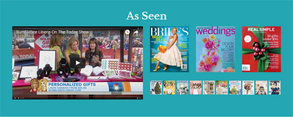
Towards the bottom of every single page, I have a dedicated section for social proof which lends to the credibility of my site.
After all, we’ve been featured on a whole bunch of different magazines and we’ve been on the Today show, so what’s the point if we don’t brag about it?
Our social proof/press mentions section is on every single page of the site so even if you don’t see it the first time around, you will eventually notice.
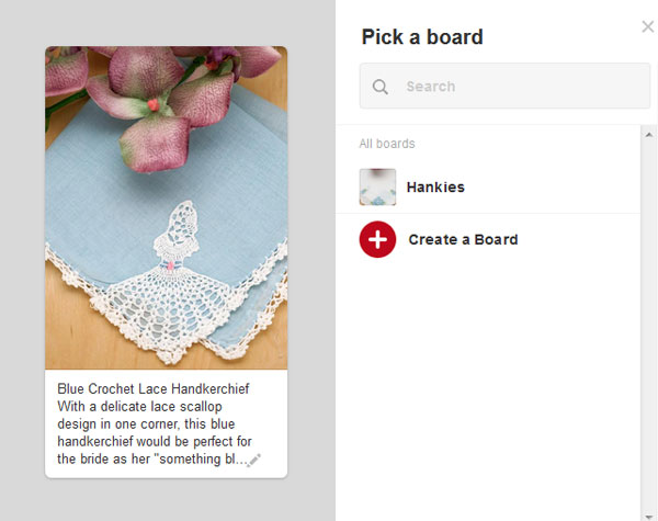
I also asked a bunch of our customers for their photo and a testimonial which is displayed just below the press section.
These are real customers who shopped on our site, were very happy with their purchase, and were willing to leave a very nice testimonial for us.
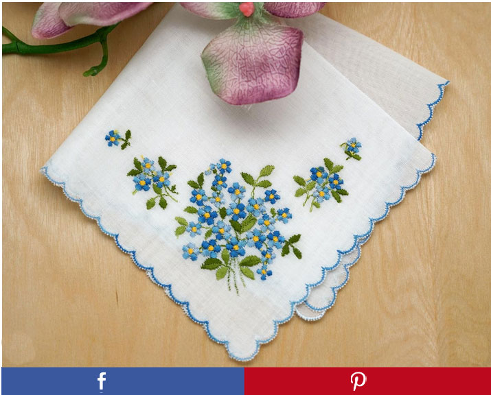
One particular customer Sherri has purchased over a hundred and fifty times from our site because she really likes our handkerchiefs.
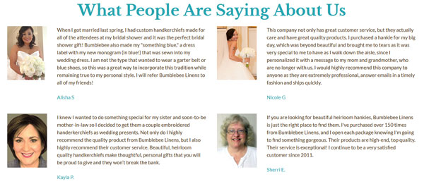
And finally, I’ve included some verbiage that reassures the customer that their satisfaction is our main concern. We never let a customer leave unhappy. And if anything ever goes wrong we provide full refunds.

Changing Up The Navigation
Redesigning the navigation for my new site was an area where I struggled. First off, I’m a HUGE fan of left hand side navigation. My old design had it and my customers loved it because the menu was always visible and accessible.
The left side of a webpage is also where your eye naturally gravitates towards and it’s the most obvious place to start shopping.
But here was my dilemma…
If I were to include a dedicated left hand column for navigation, everything else on the site would have to shrink.
For example, all of my product images would need to be reduced significantly which would negatively impact conversions.
My category images would be smaller which would lower the CTR.
The verbiage on each page would take up more screen real estate which would push products further down the page.
So ultimately, I went with a top level, hover-style, drop down menu. The beauty of a top level navigation bar is that it behaves similar to a left hand navigation bar, but it doesn’t occupy the same amount of screen real estate.
And by moving the navigation to the top, I was able to blow up my category and product images by 300% which made them really pop.
The other advantage of using top level navigation was the ability to separate out distinct categories in a very clean fashion.
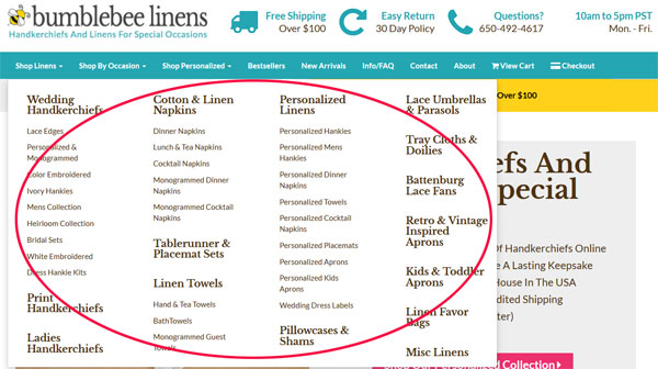
For example, I now have a distinct “Shop By Occasion” category pull down whereas in my old design, this section was mixed in with the rest of the left hand menu so it didn’t stand out.
I also added a special section dedicated for personalized goods, best sellers, new arrivals, a FAQ page, a contact page, the about page, view cart and check out.
Basically, all of the most important navigation items are now in the main bar for everybody to see.
Emphasizing My Unique Value Proposition
One important principle that I teach in my ecommerce course is that every single landing page on your site must have a strong unique value proposition.
Why should someone buy from your store? Why should I shop here as opposed to a competitor? The answer should be clear right away.
So for this design, I chose to emphasize our strengths front and center on every page on our site.
For example on the front page, our value proposition is right smack within the splash image.

On our category pages, I implemented a special text box to convey why our store is special.
The ultimate goal is to convince a customer within the first 5 seconds why they should buy from you and not a competitor.
Beautifying The Product Pages
One of the biggest takeaways from my site critique was that my product pages were not up to par.
Here’s a product page from the old design.
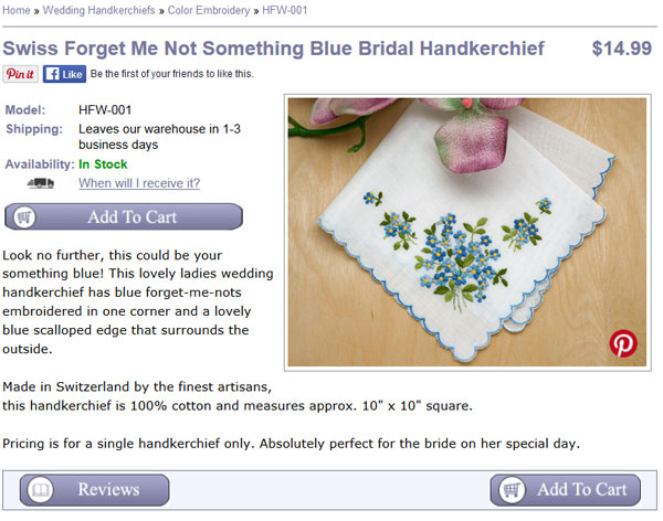
Here’s that the same page looks like on my new site.
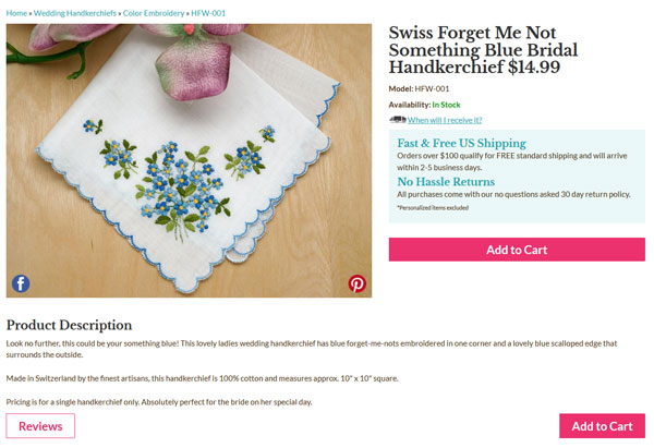
Do you notice any differences? First off, because I removed the left hand side bar, I was able to increase the size of the product image by 266%.
Not only is the main image a lot larger, but I also rearranged the elements of the product page to encourage more “Add To Cart” clicks.
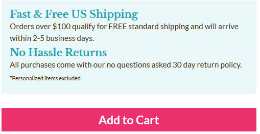
For example right next to the “Add To Cart” button are text boxes that reassure the customer of free shipping and no hassle returns.
There is also a link up top that dynamically tells the customer when they’ll receive their order depending on whether they choose standard or express, and all the related shipping fees involved.
I also superimposed Pinterest and Facebook buttons directly on the image itself to encourage sharing after noticing that most visitors didn’t even look at the dedicated share buttons on my old site.
One thing that is interesting to note is that I originally had two huge blue and red buttons to share on Facebook and Pinterest right under the image as shown below.
But ultimately I decided to remove them because they stood out more than the hot pink “Add To Cart” button. In the end, I value an “Add To Cart” action far more than a social media share.
Finally, I also increased the size of the cross sell section to entice the customer to buy similar items.
Improving Checkout
Improving the checkout process wasn’t a huge priority for me because there weren’t any gross problems with the old site. But since I had the hood opened up already, I decided to fix some outstanding issues that have been lingering on my site for quite some time.
First off, every now and then we would get calls from people who were confused and wondered if they needed an account to shop on our site. Here’s what the first checkout page looked like on our old site.
The solution to this problem was to hide the login by default and only display two hot pink buttons for check out.
I also made the trust logos more prominent to reassure the customer that checkout is secure and that their satisfaction is guaranteed.
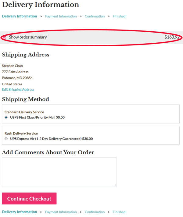
The other major change was that I made the checkout completely responsive.
Note: If you are on Shopify, then you’ve probably already seen what a good looking responsive checkout process looks like.
So instead of reinventing the wheel, I basically emulated Shopify’s checkout design because it’s pretty awesome.
In a nutshell, here’s what my checkout looks like now across different screen sizes.
For desktop…
For tablet and mobile
A Few Words About Mobile
During my last site redesign in 2013, I implemented a completely separate mobile website apart from the desktop site which lived in a different subdomain.
And while I still believe that it was the right decision at the time, it is definitely not the case today. Today, there are many frameworks like BootStrap which make responsive design so much easier.
Over the past several years, it has been a major pain in the butt to keep my mobile and desktop sites in sync so I’m happy to now have a single unified site across all platforms.
The main downside of going responsive was that I had to thoroughly test the site across 3 completely different platforms, desktop, tablet and mobile. And within each platform were multiple browser versions and screen resolutions to deal with.
For example, I had to test IE 8, 9, 10 and 11 for Windows machines. I had to test Safari 6,7 and 8 for Macs.
In the end, I went through my Google Analytics account to perform usability testing for each and every browser that has been used on my site in the past year using a tool called Browser Stack.
Needless to say, this process sucked and was my least favorite part of the redesign:(
Anyway, here are a few highlights regarding the new mobile design. Most of these line items are pretty standard so I won’t bore you with too many details.
On tablet and mobile, I changed the the menu to collapse to a single pull down menu.
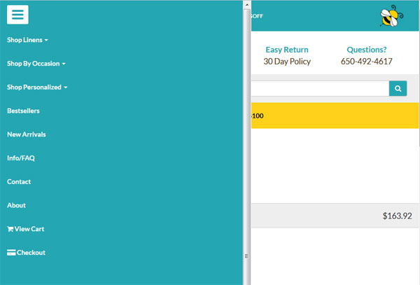
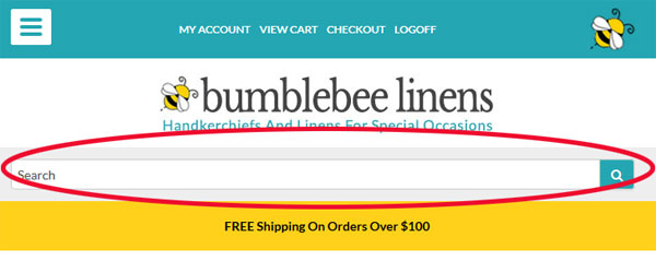
Based on my previous mobile site, I discovered that everyone tends to go straight for the search bar so I made sure to include the search bar front and center on every single page on the mobile site.
Because the screen real estate is much smaller on a phone, I removed certain “non essential” elements of the page for smaller screen sizes.
Pinterest Changes
The final change I made was I completely revamped my content pages. As I’ve mentioned many times in the past, I use our arts and craft pages to funnel people over to our online store. And Pinterest is a large traffic source for these pages.
As a result, I completely redid most of the craft images and made special tall and skinny versions just for Pinterest. I also made brand new images for our product photos as well.
For example, instead of using a rectangular image for Pinterest when you click on the “pin” button you now get a tall and skinny version that is hi res.
Conclusion
All in all, 7 weeks and $1840 is a pretty good investment for the gains that I’m now experiencing. My main problem right now is that I have too many projects going on simultaneously and not enough time to work on each one.
But here’s the thing…
Even though my conversion rate was good before, the net increase in sales due to an even better conversion rate will likely trump the other traffic building efforts I had planned to implement this year.
And if there’s a lesson to be learned here, it’s that increasing the conversion rate for your site will increase sales across all of your other traffic sources.
The foundation for your ecommerce business starts with your platform and it’s important to have all of your ducks in place BEFORE you focus on building traffic.

Ready To Get Serious About Starting An Online Business?
If you are really considering starting your own online business, then you have to check out my free mini course on How To Create A Niche Online Store In 5 Easy Steps.
In this 6 day mini course, I reveal the steps that my wife and I took to earn 100 thousand dollars in the span of just a year. Best of all, it's free and you'll receive weekly ecommerce tips and strategies!
Related Posts In Conversion Optimization
- The Dangers Of Using Free WordPress Plugins And Javascript Code On Your Site
- How Fake Coupon And Deal Sites Are Stealing Your Sales And What To Do About It
- The Best Online Shopping Websites Use These 9 Pages To Improve Customer Trust And Bounce Rate
- Do You Need A 1800 Toll Free Number For Your Online Business?
- 8 Product Photography Lighting Tips To Take Amazing Photos

Steve Chou is a highly recognized influencer in the ecommerce space and has taught thousands of students how to effectively sell physical products online over at ProfitableOnlineStore.com.
His blog, MyWifeQuitHerJob.com, has been featured in Forbes, Inc, The New York Times, Entrepreneur and MSNBC.
He's also a contributing author for BigCommerce, Klaviyo, ManyChat, Printful, Privy, CXL, Ecommerce Fuel, GlockApps, Privy, Social Media Examiner, Web Designer Depot, Sumo and other leading business publications.
In addition, he runs a popular ecommerce podcast, My Wife Quit Her Job, which is a top 25 marketing show on all of Apple Podcasts.
To stay up to date with all of the latest ecommerce trends, Steve runs a 7 figure ecommerce store, BumblebeeLinens.com, with his wife and puts on an annual ecommerce conference called The Sellers Summit.
Steve carries both a bachelors and a masters degree in electrical engineering from Stanford University. Despite majoring in electrical engineering, he spent a good portion of his graduate education studying entrepreneurship and the mechanics of running small businesses.


Wow, the new site looks REALLY GREAT!!!!
I’m really glad you finally updated the look of your site. I agree with the mastermind people (although I did purchase your program because you displayed expertise in other areas where I was weak). However, conversions are my thing. I’m a conversion analyst by trade so this article was a little painful to read.
First, the conversion numbers you quote aren’t reliable because your “control” has way too many differences than just the redesign. The only way to get an accurate comparison is to A/B test the same traffic during the same time frame. The same time last year is not a good control because the PPC keywords could be different, the competitive landscape could be different, your pricing has probably changed(?) or minimum wage has, etc. (the list goes on and on). Only A/B tests run to proper sample size with a proper representative sample can tell you the lift was due to the redesign and nothing else.
I’ve talked with the team at Amazon. They don’t get high conversions despite their design. They’ve tested their design. Their testing team is incredible. The design is intentional. Beauty doesn’t always convert. Ugliness doesn’t always bounce people. Copying Amazon is typically a bad idea because no website has the exact same target market and so you should never copy anyone, even your direct competitors.
Leaving out the left navigation may be the right thing to do but it shouldn’t be your opinion, it should be tested. Smaller images on the category pages in my experience some times increases CTR because people want to see a bigger picture so they “click through.” I never know until I test it. Every niche audience wants/expects different things.
I could go on but basically I’m happy that the site looks better, but I wish you would use actual scientific conversion optimization processes to report on the effects of the design.
Hey Peter,
I agree with you 100%. The only true way to get an accurate conversion rate increase number is to split test. Perhaps I should have put a disclaimer in the post.
But would it have been a good use of my time to set everything up and gather data for several months? Maybe…maybe not…
So I took a short cut in the interests of time. If the conversion increase was within single digits, then I would have ruled everything inconclusive. But a 42% increase seems a little egregious to be a coincidence. It’s possible but highly unlikely IMO.
In any case, I had other motivations for redesigning the site other than to just make more money and I’m in the process of setting up split tests for the product pages. So please be patient with me:)
Appreciate the comment!
Thanks for the clarification. I definitely agree there are times to sacrifice science for greater business objectives. I think I was thrown off by the heading of the post. If that heading was on a blog like conversionxl then the readers would be expecting science, but your readers are more concerned about overall business. Sorry I got a bit nit picky! Looking forward to hearing about your upcoming split tests!
Those are some impressive changes Steve! The website re-design looks great and I love the conversion boosts you were able to get from it. So many times we focus on driving new traffic that we don’t think or spend time to improve the current components of our sites. Your case study shows just how much of a return you can gained by concentrating on your efforts there.
I do understand though, that as business owners, time can slip away from us as we are always working on projects. Although a web site makeover or conversion funnel analysis is due for a visit, it may be easier to put off.
With the stats you’ve shown, it seems we can not afford to ignore the work. Time to roll up the sleeves and just get it done!
Thanks Steve.
Danny Louie
Change design every three years for me is the best way to go. If you look at any successful website in “time machine” you’ll notice a constant evolution of the website’s design.
Well done Steve for your new design, it looks awesome.
I believe, more important than design is the branding and expertise you offer to your reader.
I give you a recent example.
Today I’ve added to my “Best Of The Web Series” a website that is 2 weeks old and the design looks like from the 90s.
I usually only take into consideration the best articles wrote by bloggers with some authority, however in the case of this new blogger, her article was so helpful and well explained that I had to post it for my readership.
One more thing.
I don’t think is necessary an A/B test for a full redesign. Usually, with a new and modern design the conversation increase as far as you don’t move around the website structure.
in the case you want to change the layout, better wait for a month after the website’ redesign is complete.
Wheww – I am so glad you updated your site. I definitely agree with the guy who said I wouldn’t buy your from your blog based on your other business’ website because that is exactly what happened with my experience. I felt your business website was dated and reminded me of a ‘scam’ type website as does this blog although I honestly feel you are genuine and a great source of information. I didn’t feel comfortable. I never noticed how important the visual appeal of a website was until this post. I will try to have some friends review my site and hopefully they give me raw feedback that I can grow from too!
One question – you spoke about having a phone number and address on website. I have a small custom keepsakes business that I run out of my home and am not sure how to approach having my phone/address on my site. I didn’t see this information on your blog. Should it be disclosed only on certain types of site or once your site reaches a certain level?
Thanks for the great info and again – Congrats again on the new site!
Thanks Kelly and it’s good to know that you felt the same way as Kevin. Hopefully the new design will absolve me of these issues going forward.
Hi Kelly – Just wanted to add my 2 cents about the home address and telephone number thing.
We work from home and did not want our private information out there in the public domain. So, I use voiptalk.com (I am based in the UK) and I was able to choose a landline that had the same area code as my location. This costs me less than £5 / month and I divert it to my cell phone. Customer thinks they are calling an ‘office’ based in my geographical location – I can be on the road, somewhere else entirely.
The address was more complicated – the only way we can do this is by renting a PO box at our local storage facility. A real person checks our mail, and puts it in our mailbox. We keep our stock in a unit at this facility, and we have had several meetings with customers there.
Yes, this costs us each month, but we keep our private details off the internet.
This was one of the first things we had to solve when we first started, as we felt that a physical address and a real landline telephone number were so important in building that customer trust.
Steve,
The site looks great! I was surprised when I first started following you and I saw the look of your site. But I thought “it definitely is working for him, so what do I know?”. The new site is fabulous.
I am definitely stealing some of your ideas, and I have already implemented some of your suggestions from our conversation.
Thanks again!
Margaret
“For example, instead of using a rectangular image for Pinterest when you click on the “pin” button you now get a tall and skinny version that is hi res.”
How do you set this up for the different image, and prepopulate the pin description with a custom description?
Hey Carole,
The pinterest button is just a link that specifies the image to be used along with the pin description. I believe it’s just HTML. You can dump the source on my product page to see what I mean.
Hi Steve,
The new site looks much better – great job! Good point on the contact info. We took our phone number down because it was becoming a drag on resources and we prefer to interact by email where we can use our helpdesk software. You’re making me rethink that decision…..
I’m more of a branding guy – whereas you seem to be more of a tech/science minded guy so I would place the emphasis on the branding aspects of a redesign, some of which you cover (social proof, product pages.)
I have a full article on improving your visual branding here:
http://www.indiebrandbuilder.com/brandimage/
All the best, Jeremy
Hi Steve ~
As a student in your course (which is great!) I must admit that redesigning Bumblebee Linens was long overdue. While the improved conversion rate on your site is impressive, I’ll bet that you’ll gain a lot more students because of it as well.
You’re the real deal when it comes to helping people gain the knowledge and courage they need to start an eCommerce business but for those on the fence it was hard to “see” that based on your shop design.
I also wanted to add a free tool to your color-scheme discussion. I love coolors.co because it let’s you create a pallet of five colors. You start the generator and “lock in” colors that appeal to you, press Enter and the tool will find complimentary colors until all five spots are locked. And, you can print a PDF of the pallet, which includes the HEX, RGB, HSV and CMYK codes. That makes it easy to share with designers, manufacturers, etc.
Cheers!
Ree
Thank you so much for the kind words Ree! I’ve loved having you as a student in the class and thanks for the color palette resource as well. I have not heard of it before.
Thank you for sharing your journey and the fantastic tools you used, I managed to get so much out of this article! I loved the way back machine website – cool! – and the tiny little tip from someone leaving a comment on your previous design [he buys old sites, fixes them and sells for the profit] – it actually inspired me to include it in my growth strategy. Excellent job, Shared and LOVED! Maggie, Rock Paper Copy
Make money online
http://www.clixsense.com/?8172285
Hi,
Thank you for creating such an informative website! I’ve found the info you offer quite valuable. You also did a phenomenal job on your redesign.
Since you seem to value input from users’ experiences, I wanted to share two experiences on your site that I found to not be as expected:
When I visited a product or category page on the redesigned site, I was not able to click the main logo on the top to return to the home page.
Also, I love the way integrated the magazine cover images and/or logos for the press coverage both on the home page and also on the category pages. However, I tried to click them expecting to be brought either to the respective article/feature or to the “In the Press” page, but instead found that they were static images with no link.
Again, thanks for a great, very informative site. I will definitely be following your blog going forward.
Best regards!
Maria
I budgeted about 6 weeks to get the redesign done with me contributing about 40 hours of my own time. !!