Sometimes a seemingly insignificant change to your web design and development and/or online strategy can pay huge dividends. And in many cases, the answer to improving sales requires very little effort to implement.
In this article, I’m going to discuss some simple tweaks that we made to our website that had a dramatic impact on our business.
Before I get into the guts of what we did, I just want to stress the importance of obtaining quality metrics for your website.
It is especially vital that you accurately track the way a customer navigates through your online store. Do they leave your website from a particular page? Are they having problems finding a particular product?
As long as you have a way to evaluate how your customer interacts with your products and website, you can spot and make changes to allow them to find your products faster and easier.
The information you gather will allow you to make small tweaks to improve the customer experience. Here are some little things we implemented that helped out our store sales significantly.
Get My Free Mini Course On How To Start A Successful Ecommerce Store
If you are interested in starting an ecommerce business, I put together a comprehensive package of resources that will help you launch your own online store from complete scratch. Be sure to grab it before you leave!
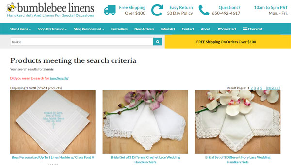
We Improved Our On Site Search
Because our store is pretty small and our hierarchy of products do not go very deep, I never really devoted many cycles towards our internal on-site search engine.
Once someone found us via Google, Yahoo etc…, I didn’t think that customers actually used the ‘search’ feature on our website much at all.
But once I started paying attention to our on-site web analytics, the data indicated otherwise. It turns out that about a third of our visitors use our product search bar at some point during their visit.
And the huge stat that stood out to me was that almost 70% of visitors leave immediately after executing a single search query.
In fact, our search results page was one of the top exit pages on our shop!
While this exit percentage initially seemed a bit high, I never really thought much of it.
Why?
Because we get a ton of random search visitors from the web, I assumed that most of them were simply looking for products that we didn’t carry.
In any case, I had some free time one day so I decided to investigate this a little bit further.
And by manually typing in the same exact customer queries I was seeing on the site, I discovered that most of these searches returned 0 results when they should have returned relevant products!
Was our search busted all of this time?
I tried other searches to make sure but strangely enough, the searches that I entered were always successful. Why were the customer searches busted and not mine?
The answer turned out to be very simple. A long time ago when our server was under powered, I limited the scope of our search in order to reduce CPU usage.
Essentially, I nerfed our search so that it only searched the product titles and not the descriptions. Therefore, searches for “Mother of the Bride” or “Father of the Bride” returned no matches.
As soon as I switched the search to include all of the product descriptions, the exit rate for all of our searches went way down.
Anyway, once I went down the search rabbit hole, I decided to do a major overhaul of our entire onsite search engine.
While the details of my improvements are beyond the scope of this article, you can see exactly what I did by checking out my post on On Site Search Mistakes That Are Killing 30% Of Your Sales (And How To Fix Them)
Click here for my in-depth post on how to improve your on site search engine
We Made Mobile Checkout Easier
If your online store website is anything like mine, chances are that your mobile traffic is probably increasing exponentially every year while your desktop traffic remains flat.
More and more customers are making transactions on their tiny little mobile phones but the main hurdle to generating mobile sales is that it’s a pain in the butt to checkout.
Not only does a customer have to enter in their name and address on a tiny little on screen keyboard, but then they have to dig deep into their wallets for a credit card and type in the numbers.
What a pain!
The single most important conversion tweak that you can make to your site is to allow checkout with the least amount of typing possible.
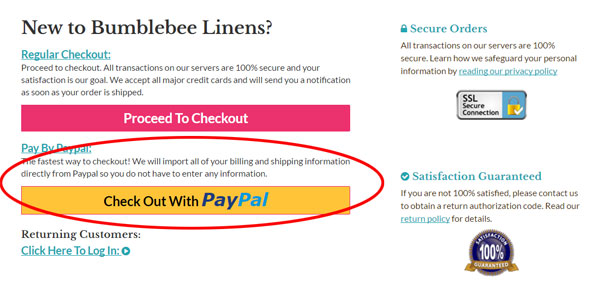
For example, we recently implemented Paypal One Touch which was a major contributor to our increase in mobile conversions this past year.
Note: You can read more about it in my post on How An Easy Tweak Boosted Mobile And Tablet Conversion Rates By 31%
Going forward, I see services like Apple Pay and Android Pay becoming more and more essential because they already have all of your information stored in the cloud and you don’t have to type in anything.
Going forward, you should expect Facebook to make major strides in ecommerce as well.
Bottom line, if you are not reducing checkout friction on your mobile site, you MUST do so as soon as you can.
Here are other posts that I’ve written on the topic.
- How To Organize Your Mobile Website To Maximize Usability And Sales
- Making Forms Mobile Friendly And How IPhone AutoCorrect Almost Cost Us A Big Order
We Implemented The Turner Technique
Email continues to be a huge contributor to sales for both my online store and my blog.
And as I mentioned in my last income report, email brought in over 21% of my sales for my ecommerce store last year.
For MyWifeQuitHerJob.com, email continues to bring in over 90% of my revenues. In fact, I can tell you exactly how much every email subscriber is worth!
Because email is so important, I spend a lot of time trying to tweak my email opt-in rates.
Now I’ve tried many things over the years from popups to slideins to static forms, but the Turner Technique has been by far the most effective tweak that I’ve ever made to an email signup form ever.
What exactly is the Turner Technique?
It is a strategy that my friend Brandon Turner taught me that doubled my signups almost immediately.
Read more about it here: 2 Simple Tweaks That Doubled My Email List Signups And My Take On Single Vs Double Optin
And while you are at it, go check out How To Get 300 Email Subscribers Per Day And My Best Converting Signup Forms
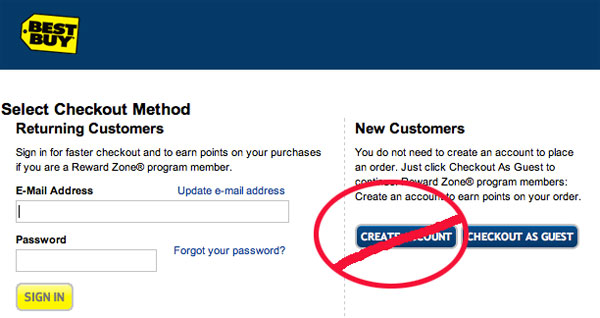
We Removed Guest Checkout
For some strange reason, every single shopping cart that I’ve ever seen provides the ability for a visitor to create an account during checkout.
Some carts ask a customer to decide whether they want to create an account up front on the first screen while others like Shopify are much more subtle and ask for a password during checkout.
In theory, creating an account is a good thing. It allows a customer to avoid having to type in their information on a subsequent visit to streamline the checkout process.
But in reality, it causes nothing but headaches and confusion.
First off, very few people want to “create an account”. Creating an account implies that you are saving their information (which you are) for future marketing opportunities and most people are reluctant to do so.
Second of all, people who actually want to create an account often forget their passwords which creates extra friction during the checkout process.
Before we eliminated “accounts”, we were getting several phone calls a week from customers who forgot their passwords, couldn’t figure out how to reset them and wanted to checkout over the phone as a result.
Now if we’re getting 3-4 phone calls a week about this, I’m betting that there are 10X more people out there who don’t call in and bail as a result.
Once we eliminated accounts, all of these phone calls stopped.
Here’s the thing.
Outside of our wedding planner and hotel clients who buy from us regularly, very few of our customers actually need an account.
The advantage of account creation is further mitigated by services like Paypal One Touch that already store a customers’ address and payment info.
For our B2B clients who actually need accounts, we manually create them and send them an easy to remember password.
Anyway If you haven’t done so already, you may want to consider removing account creation from your shop entirely as it will reduce your support load.
We Added A Pull In Item
I actually got this tip from a sales book that I read so I take no credit for this idea. In a nutshell, the basic concept is to include a popular product in your lineup at a very attractive price.
Customers will be drawn in by this one item and then you can cross sell them additional items on their way to checkout.
In all of our major product categories, we started inserting one item at rock bottom prices. We found that while some customers just purchased the cheap items and then left, the majority of them ended up buying other products at higher margins.
Sure, we don’t make much profit on these draw in items but we found that our overall order size increased significantly.
I think this tactic works because psychologically the customers feel as though he/she can buy more because they are getting such a good deal on something else.
We Added A Flexible Return Policy
When my wife and I first considered adding a flexible return policy, I thought to myself, “Why would I ever want to deal with people wanting to make returns?”
But just as an experiment, we decided to give it shot. Who would’ve guessed that adding a return policy would actually make customers want to buy more? The increase in order size was the most evident when taking customer orders over the phone.
Customer: We need to get some cocktail napkins for our engagement party but we aren’t exactly sure how many people are coming. I don’t want to buy too many or too little.
Me: Don’t worry about it. Just buy as many napkins as you need assuming everyone comes and then return what ever you don’t use!
Customer: That’s a great idea!
90% of the time, the returns are never sent back to us. I think that customers just want the security of being able to return something but rarely do they actually act on it.
Especially if you sell quality products, you have nothing to fear in accepting returns.
We Added Shipping Incentives
The final thing we did was add shipping incentives for large orders. For all orders over 100 dollars, we started offering free ground shipping anywhere!
Early on, I was skeptical of this tactic, but sure enough we started getting orders for just over 100 dollars.
When I observed the shopping patterns of random customers, I would sometimes find them hunting around the site for just one more item to put them over the edge.
The simplest way to increase your sales is by placing the free shipping threshold 15-20% above your average order size.
Find Out What Works Best For You
The key to finding the right tweaks to make to your business is to experiment and analyze the effect on your top line. But this can only be done if you instrument your website so that accurate statistics can be recorded.
Not every sales strategy will work for everyone, and sometimes it takes a bit of trial and error to get things right. The above 4 tweaks took very little time to implement and made a drastic impact on our sales.

Ready To Get Serious About Starting An Online Business?
If you are really considering starting your own online business, then you have to check out my free mini course on How To Create A Niche Online Store In 5 Easy Steps.
In this 6 day mini course, I reveal the steps that my wife and I took to earn 100 thousand dollars in the span of just a year. Best of all, it's free and you'll receive weekly ecommerce tips and strategies!
Related Posts In Conversion Optimization
- 8 Product Photography Lighting Tips To Take Amazing Photos
- PayPal One Touch – How This One Feature Increased Mobile Conversion Rates By 31%
- Poorly Designed Websites: 9 Mistakes Ecommerce Store Owners Make (And How To Fix Them)
- Common Mistakes New Online Store Owners Make That Prevent Them From Ever Being Profitable
- How To Build A Brand That People Trust And Differentiate Your Product

Steve Chou is a highly recognized influencer in the ecommerce space and has taught thousands of students how to effectively sell physical products online over at ProfitableOnlineStore.com.
His blog, MyWifeQuitHerJob.com, has been featured in Forbes, Inc, The New York Times, Entrepreneur and MSNBC.
He's also a contributing author for BigCommerce, Klaviyo, ManyChat, Printful, Privy, CXL, Ecommerce Fuel, GlockApps, Privy, Social Media Examiner, Web Designer Depot, Sumo and other leading business publications.
In addition, he runs a popular ecommerce podcast, My Wife Quit Her Job, which is a top 25 marketing show on all of Apple Podcasts.
To stay up to date with all of the latest ecommerce trends, Steve runs a 7 figure ecommerce store, BumblebeeLinens.com, with his wife and puts on an annual ecommerce conference called The Sellers Summit.
Steve carries both a bachelors and a masters degree in electrical engineering from Stanford University. Despite majoring in electrical engineering, he spent a good portion of his graduate education studying entrepreneurship and the mechanics of running small businesses.




This is an excellent bunch of advice and might I add that it makes sense to install Google’s Website Optimizer and split test everything to see what sells more.
@Seamus
I dabbled with the website optimizer early on and I think it’s a great tool, especially because its free. I find that optimizer is best used when making small tweaks to a given page and checking the results. I didn’t really need it for the search experiment but it certainly will have come in handy if I ever redesign the product layout.
@Jon
I’ve debated for a long time whether to add hacker safe to the site. They claim a 15% increase in conversions, but they charge a good amount of money to add the logo.
@Scopulus
I agree with this philosophy as long as all of the buttons don’t look cluttered on the page.
Thanks, great tips! It’s interesting how sometimes small things make a huge difference. I once read of a site who increased their sales by a fair margin by placing their “Hacker Safe” (now “McAfee Secure”) logo higher on the page! I guess if it makes your customers feel good, do it.
It is said that and if you add PayPal as a method of payment ( that if you have not already), then sales increase.
This is something i have seen working and the idea is that you give your customers as many method so there is more chance they find one thay are comfortable with.
Hi Steve,
I have 3 suggestions but they are not simple tweaks. They require some effort.
1. Set up a discussion forum on your website so that you can find out what your customers and potential customers really think.
2. Use Live Chat. My personal experience of Live Chat with Hostgator’s customer service assistants was one of the main factors I stay with them.
3. Engage your visitors using ‘Multimedia’ techniques. Displaying your products with the use of professional video clips can be very visually enticing and would be effective to create a mental image in your prospects’ mind how their parties gonna look.
If you’ve not already adopted what I’ve suggested, you might want to consider them, if not for now, then perhaps for the future.
Cheers~
Mark
Hi Mark,
I like your ideas. In fact Live Chat is something that I’m looking into right now. As for the forums, that will become a better idea once we become more established and have more traffic. If we did forums right now, they would be pretty dead. I tend to have a different philosophy in regards to ‘multimedia’ techniques. Our customer base covers a wide range. In fact, a good percentage of our customers are either on dial-up or are not good at using computers. I would prefer to keep the shopping experience as simple as possible. Don’t get me wrong. Multimedia has its place but personally I hate shopping at sites with too many distractions.
@Steve
I inquired a long time ago, before they were acquired by McAfee, and it was $1700-$1900 for me if I remember correctly. Oh yeah, PER YEAR. Because of that, I’ve never tried it out, but it would be interesting to know how often it really gets that extra 15%. I suspect it’ll make less and less difference over time as the general public becomes more accustomed to shopping online. On the other hand, McAfee thought they were worth $50 million, so what do I know?
@Jon
Our online store is still growing at a pretty fast rate so the only real way to tell Hacker Safe’s effectiveness would be to do some A/B testing over several months. I wonder if they would let me test drive their logo on our store for a short period. It’s been a while since I’ve talked to the rep. If I try it, I’ll let you know how it goes.
Love the pull item idea!
Great article Steve. Thank you.
Great tips. I need to check on my search results also. I find myself using that alot when I visit other stores.
Great Article!
Being great at sales is the aim of any business. Sales and more sales is the key to the success of any business. Like all other activities which are ruled by certain basic principles, there are rules for selling which will make sure that you seal the deal.
I always find it interesting to see those that have found a way to monetize an online store. Over the course of my “online” lifetime I have tried a number of times to make supplemental income through an online store with no success. It is very nice to see someone that has been able to not only do it, but make a significant amount of money doing it.
I always love your blog posts and articles on this website. Thanks for all you do to inform us readers.
~Heather
Do you dropship products or did you dropship when you started your online store?